Appleby Farms
A Premium Packaging Transformation
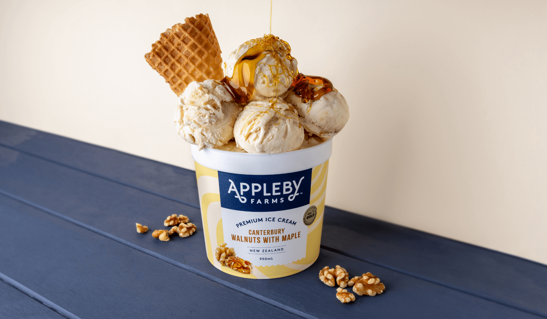
Appleby Farms—celebrated for its indulgent, premium ice cream made from the finest ingredients—has unveiled a refreshed packaging design that perfectly encapsulates its dedication to quality and flavour. The bold new look is designed to capture attention in the freezer aisle while reinforcing the brand’s reputation as a premium, irresistible choice.

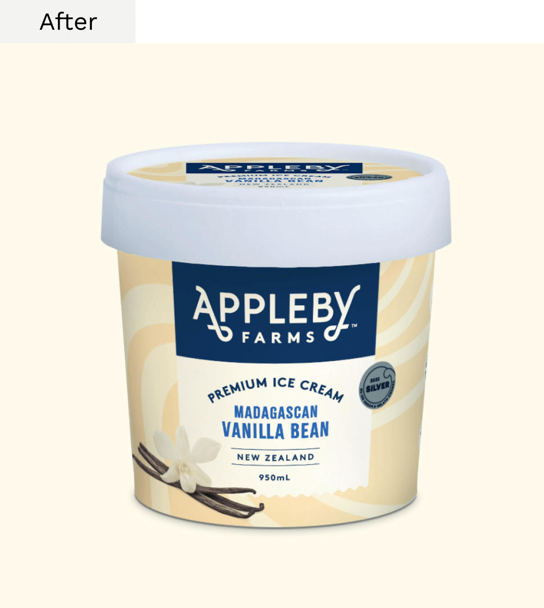
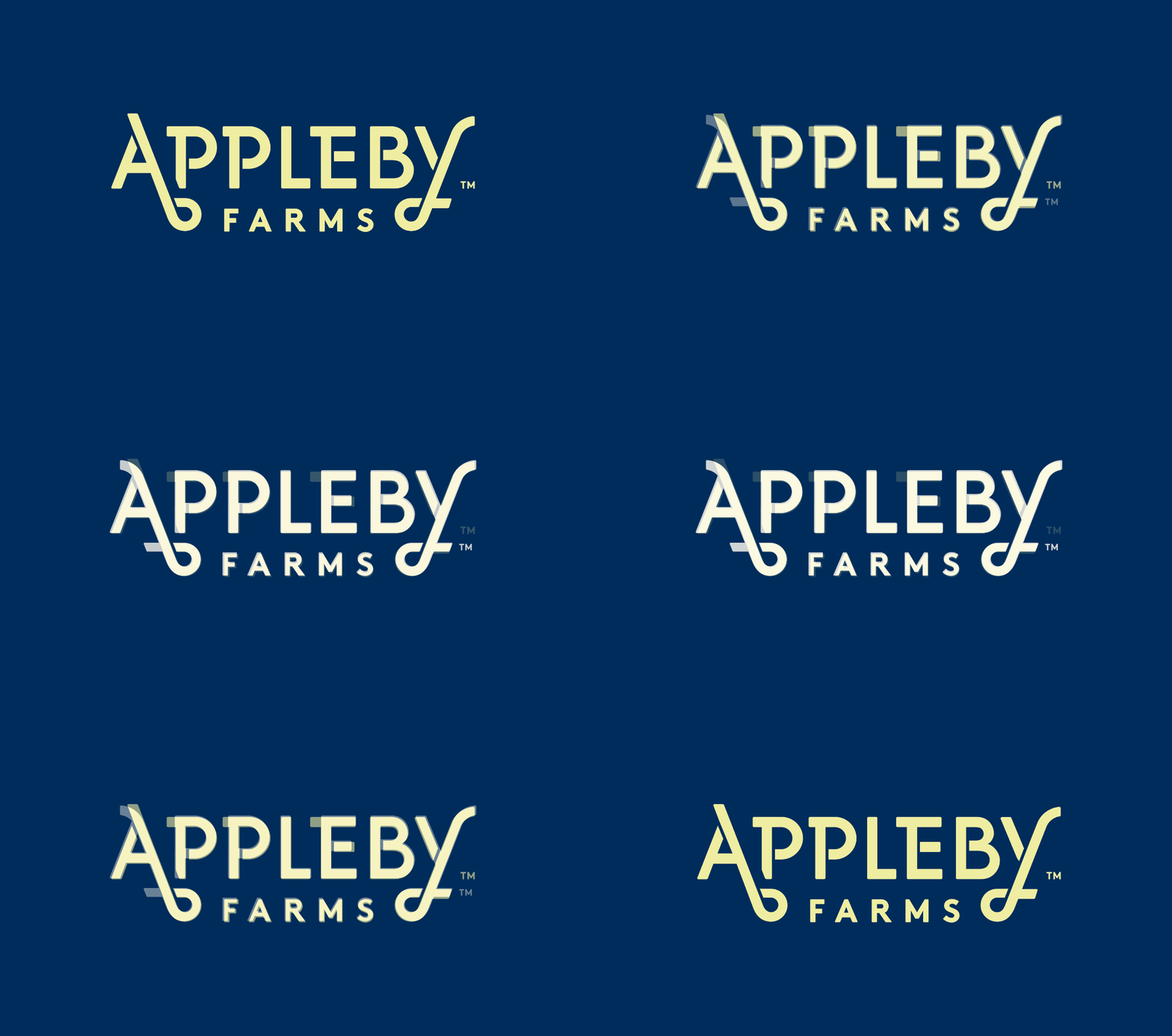

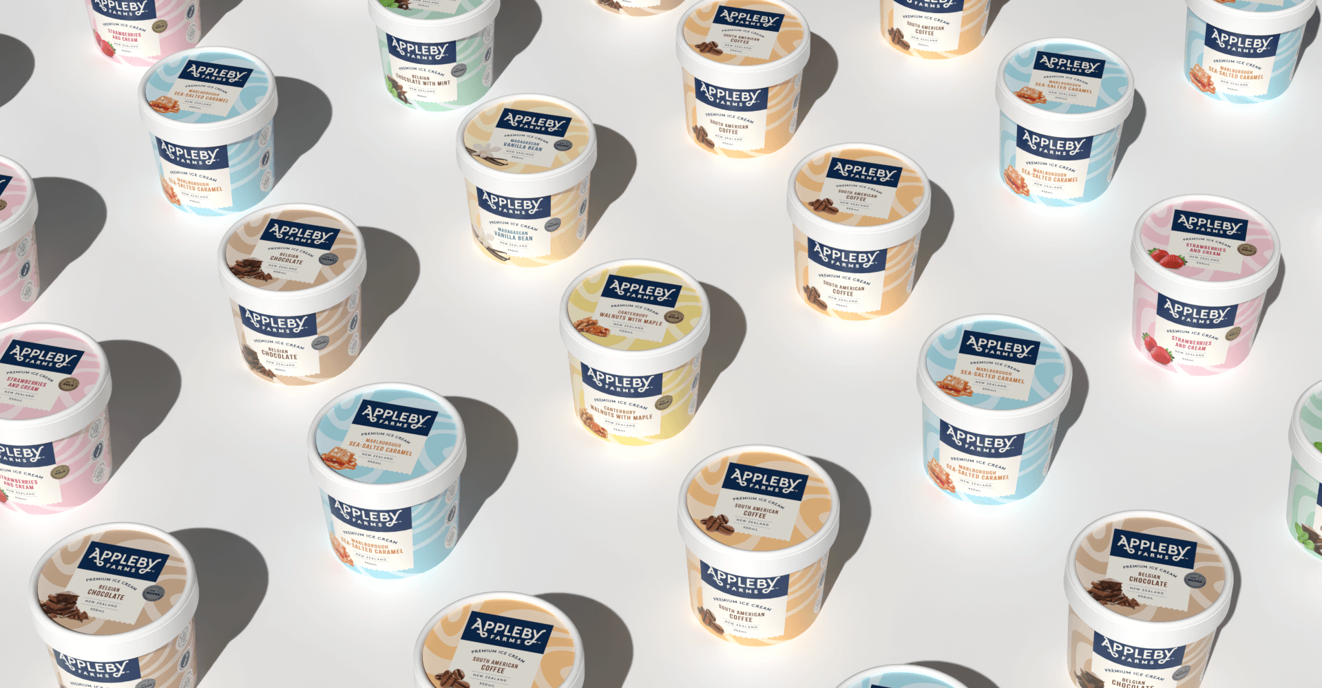
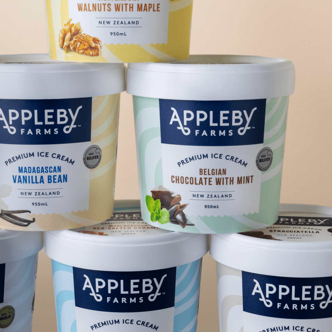
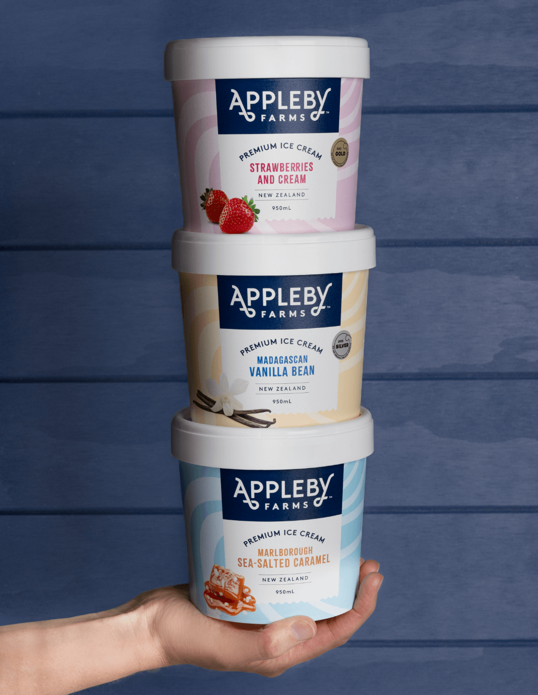
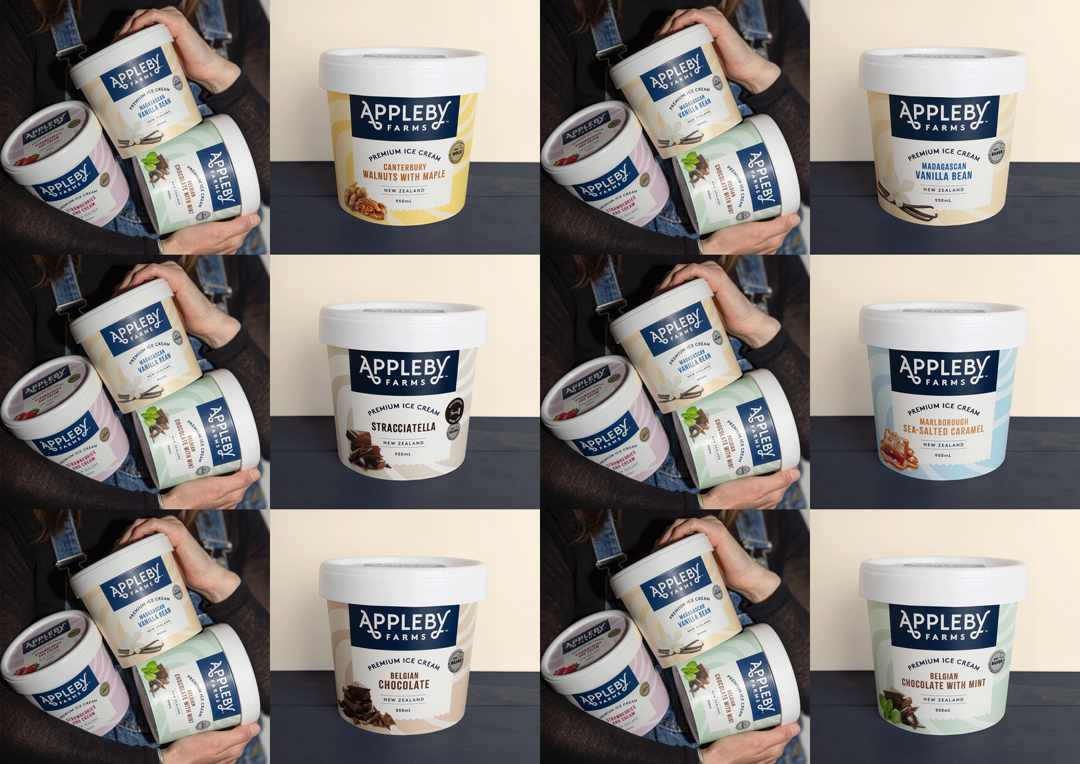
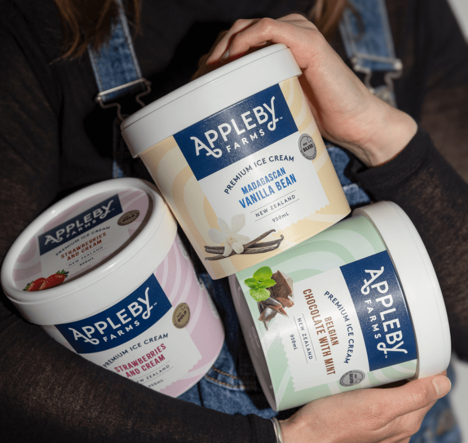
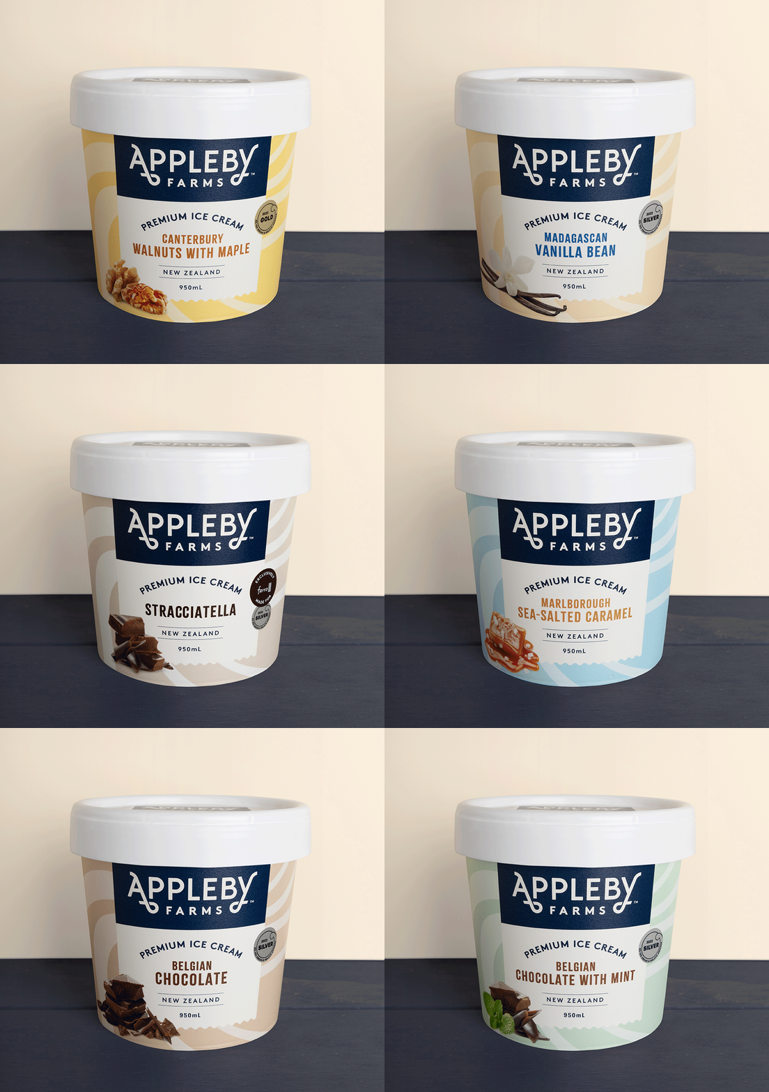

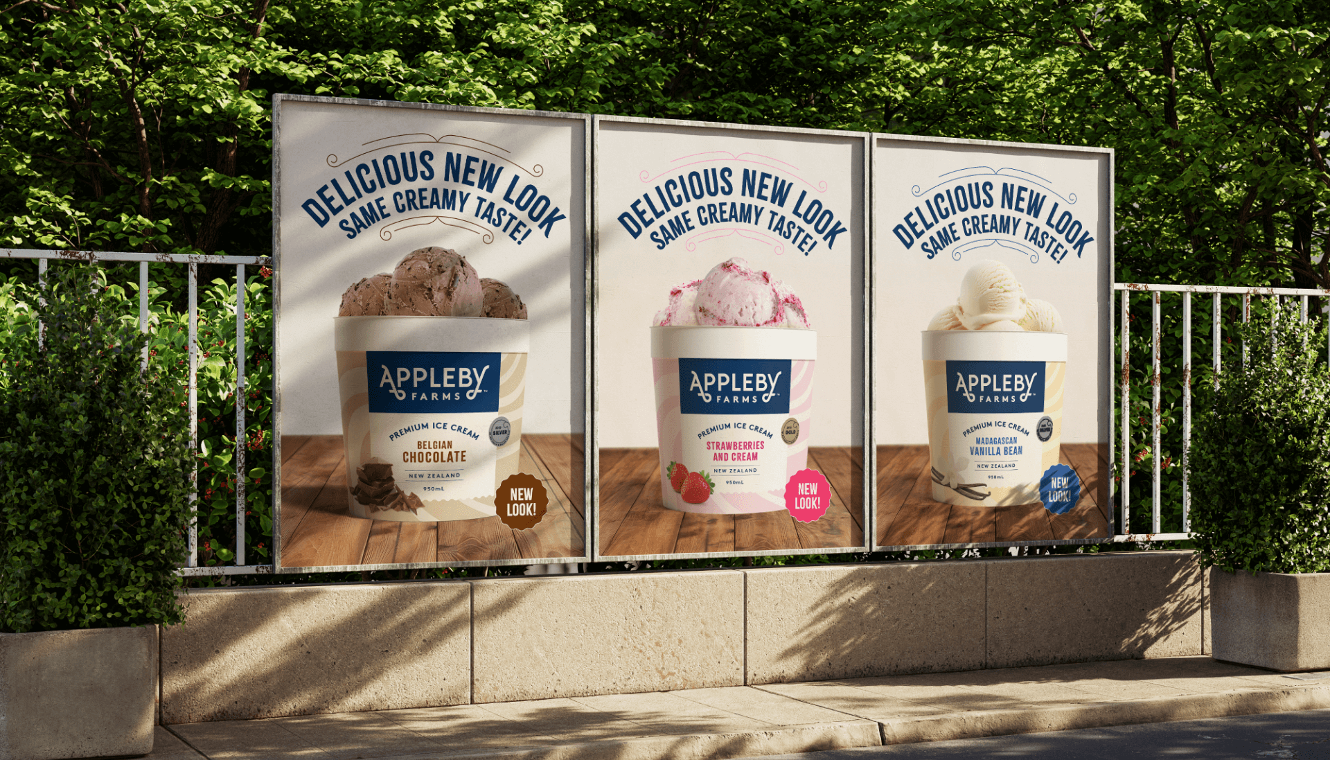

In a competitive FMCG market, boosting sales and brand awareness is priority for us. Our original packaging served us well, but it no longer reflected our premium positioning. The new design strengthens our presence with a consistent logo and swirl pattern, making Appleby Farms instantly recognisable through brand blocking. As a fast-growing, innovation-driven company, we value having a local agency that truly understands us. Downing has helped us move fast when needed while ensuring we take the time to get things right.
– Pete Findlay, CEO at Appleby Farms