
Opal Australian Barramundi Brand Development and Brand Rollout
Crafting a Premium Brand Identity for Opal Australian Barramundi
Launching Opal Australian Barramundi into the US fine dining market required more than a new identity, it demanded a complete brand system that could translate product quality into chef confidence.
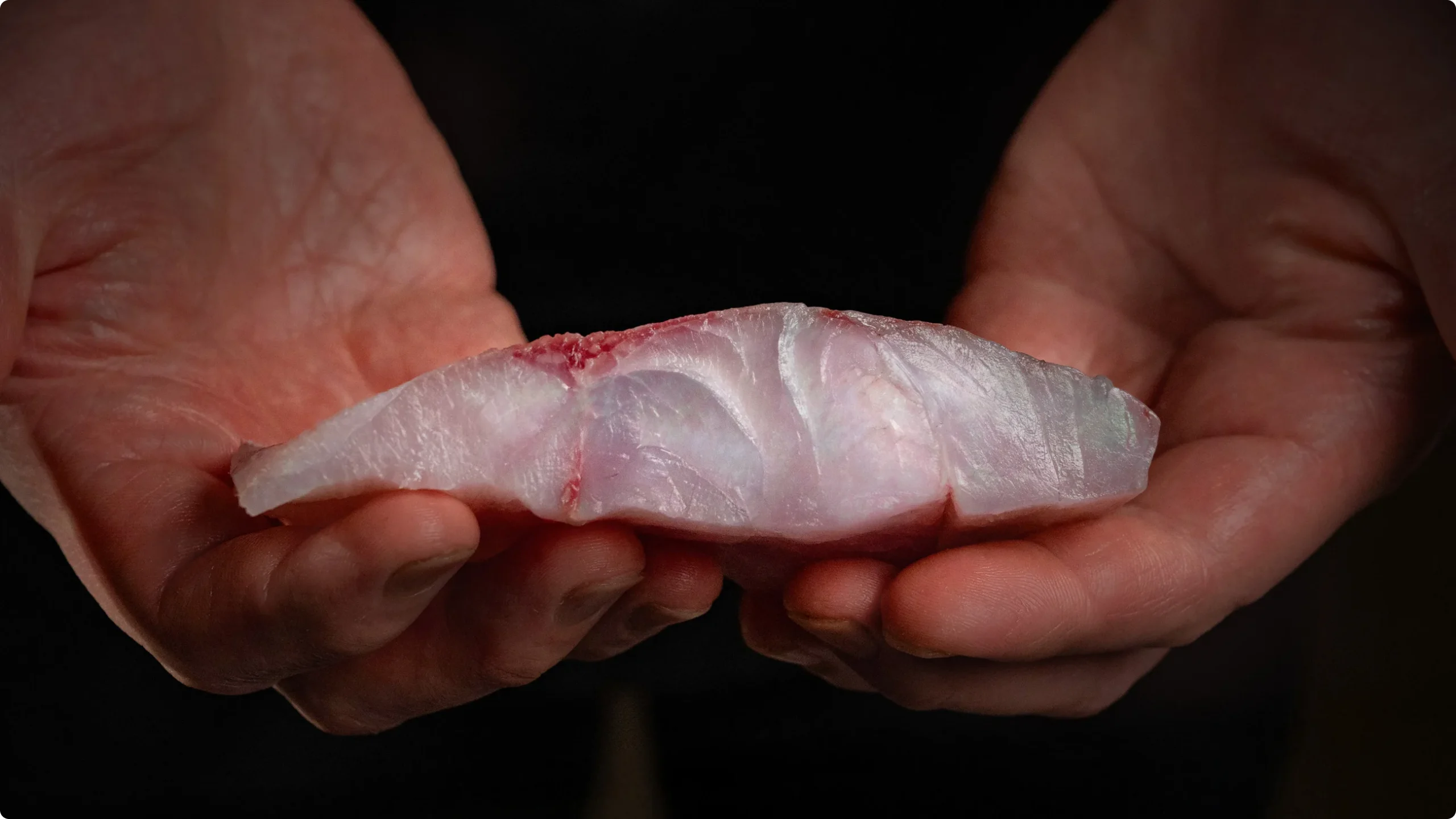
Grounded in the distinctive truth of its natural opalescence—a hallmark of sashimi-grade quality—the brand was designed to signal both beauty and performance at every touchpoint. From visual identity through to packaging, digital, and sales tools, the result is a cohesive premium experience that aligns perception with product quality and establishes Opal as the ultimate choice for leading chefs.
The result is a brand that aligns perception with product quality, earning trust with chefs and securing its place in fine dining kitchens.
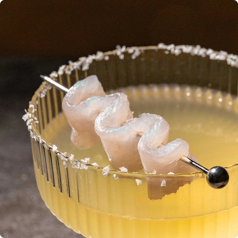
In the first month of its launch, Opal was selected by the Culinary Institute of America as the white fish of choice for its students.
The Challenge: Repositioning Humpty Doo Barramundi for the Premium US Market
Humpty Doo Barramundi approached us to create a premium export brand that could compete amongst the finest seafood available to American chefs. Through market research they had already identified a key challenge: while the product itself was exceptional, their existing brand did not register as premium with US audiences. This revealed the need to develop a new brand that could accurately communicate the product’s premium value and position it at the highest level of fine dining.
Strategy First: Defining a Distinctive Position Through Product Truth
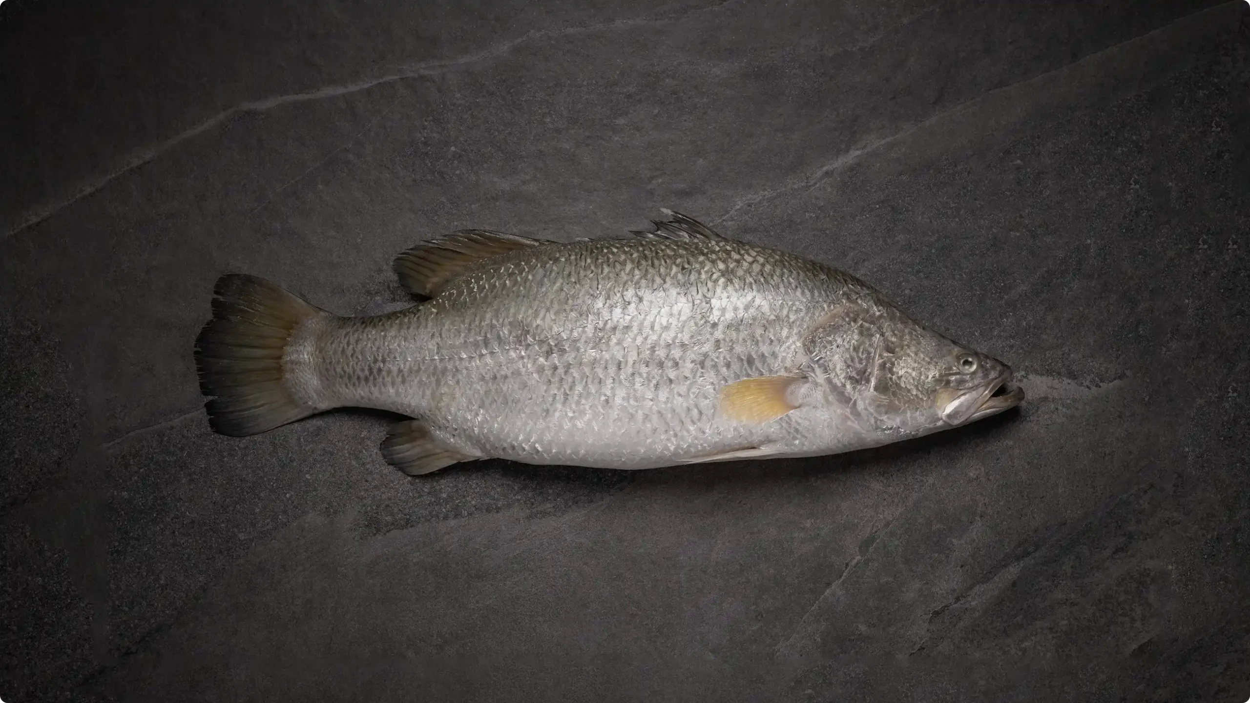
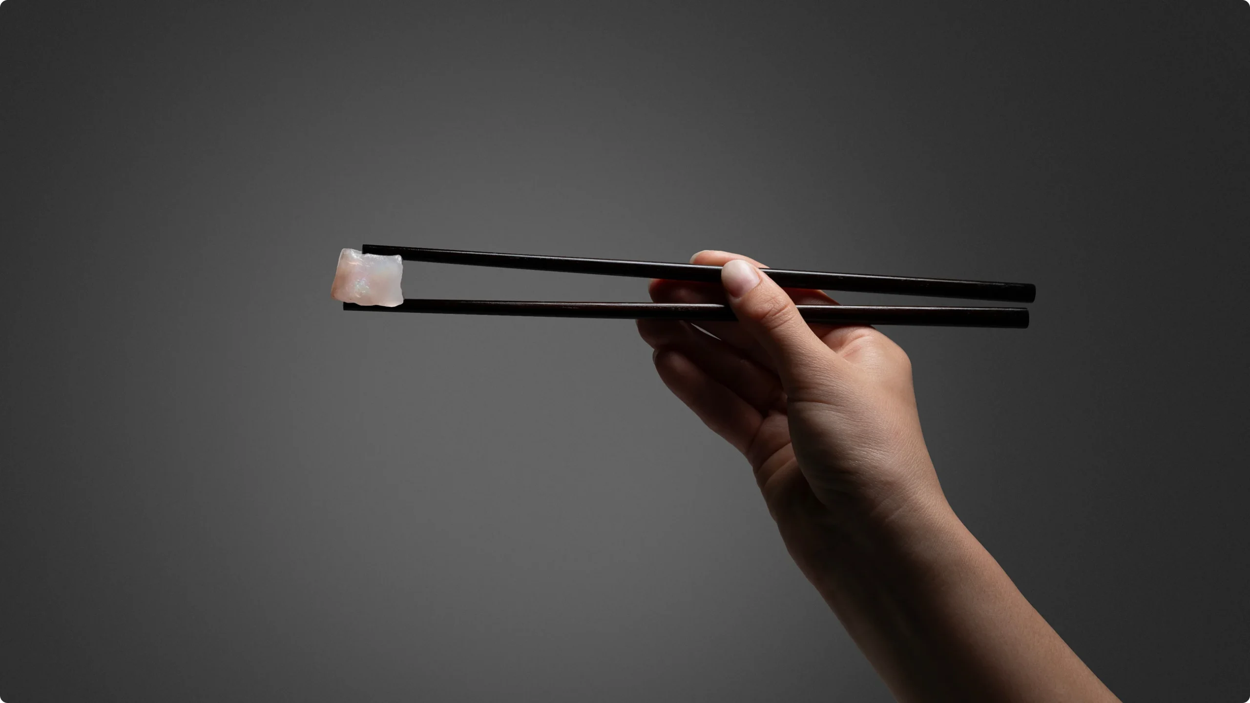
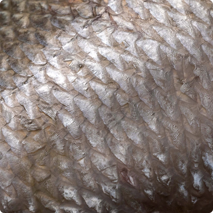
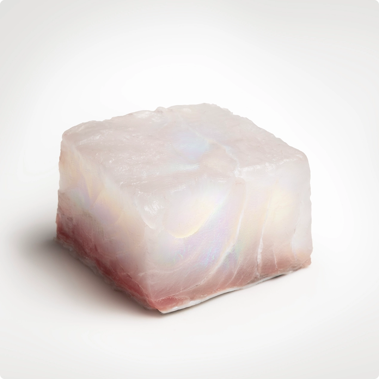
The client had identified a powerful and ownable product truth: the fish’s naturally opalescent flesh. This visual quality is a direct result of its fine muscle structure, which is a marker of sashimi-grade quality. While other white fish may exhibit this characteristic, no brand was claiming it. This became our opportunity. We positioned Opal Australian Barramundi around its natural opalescence as the hallmark of the product’s innate value to chefs—linking visual beauty with performance, versatility, and trust in the kitchen.
The Creative Solution: A Refined, Contemporary Brand Inspired by Opalescence
Our creative solution was a contemporary visual identity inspired by the fish’s natural opalescence, paired with a brand story grounded in the truths that matter most to our audience: performance, provenance, and integrity.
- Performance: Effortless versatility, from sashimi to pan-seared
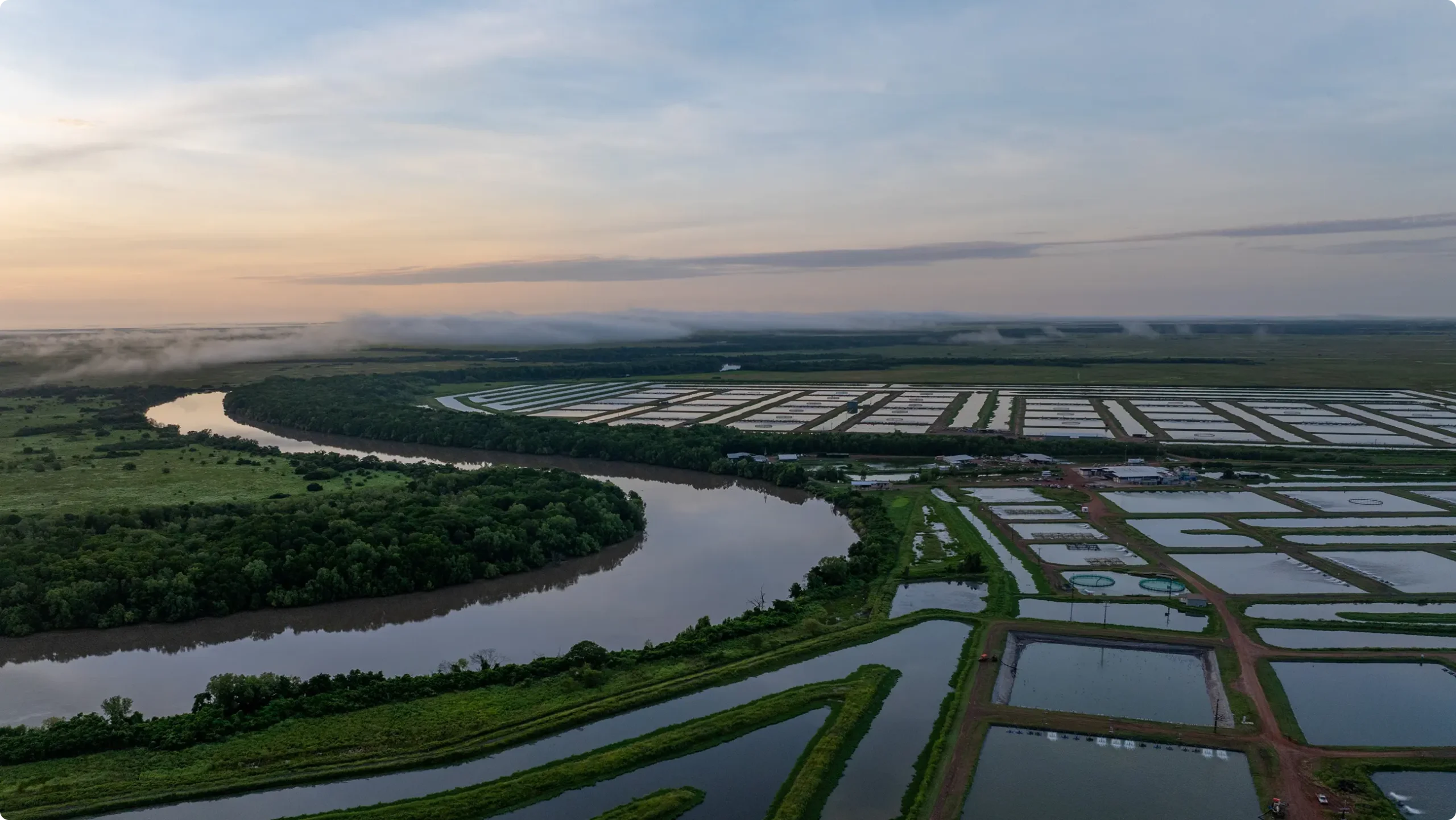
- Provenance: Raised within the natural saltwater environments of Australia’s remote Northern Territory
- Sustainability: Farmed in harmony with surrounding ecosystems through responsible, innovative practices
The result is a brand that balances visual beauty with credibility—elevating perception while remaining firmly rooted in truth.
Photography & Art Direction
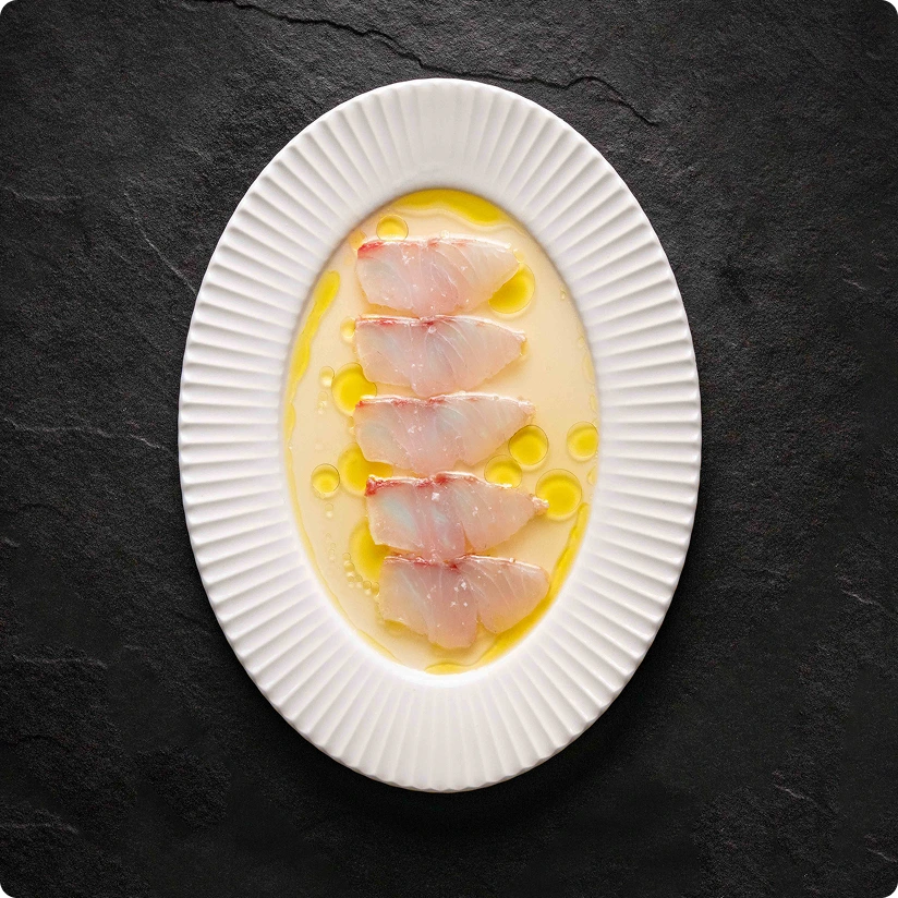
While the brand system provided a strong foundation, we identified an opportunity to elevate the visual language through premium, campaign-led imagery. We art-directed a shoot with Sydney sushi master, Sangyong of BySang Restaurant, to create high-end, editorial-style content that aligns with the expectations of discerning chefs.
Digital Ecosystem
To engage chefs effectively, we built a cohesive digital ecosystem—starting with social media to establish presence and grow a targeted audience. This extended into a premium custom website designed and built to deliver a more immersive brand experience. The site communicates product truths with clarity while reinforcing Opal’s elevated positioning.
Sales Enablement & Launch Collateral
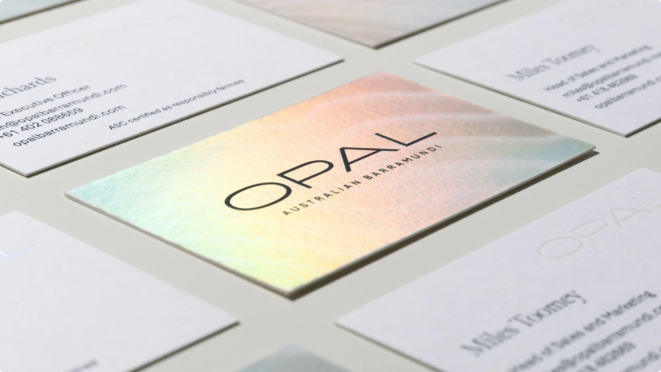
For the US market launch, we developed a suite of sales enablement tools to equip importers and distributors with a consistent, high-impact brand story. This included presentation decks, brochures, trade show flyers, custom cutting guides and business cards. Every touchpoint was considered to ensure clarity, credibility, and a premium impression when engaging prospective foodservice partners.
Packaging
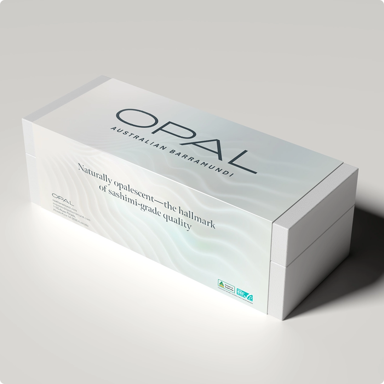
Every touchpoint was treated as part of an integrated brand experience, including our product packaging. From the moment the box is received chefs are met with a refined visual presentation, paired with practical tools to maximise performance in the kitchen. Additionally, each fish is individually identified with a branded gill tag, hand-applied as a mark of quality and traceability. The result is packaging that not only presents the product beautifully, but equips chefs with the confidence to work with it.
The Outcome: A Premium Brand Built for Fine Dining Adoption
Launching into the US market required both strategic clarity and consistent execution. Through a cohesive rollout across digital platforms and sales tools, Opal Australian Barramundi was successfully positioned as a premium offering capable of commanding a higher price point.
The result is a brand that aligns perception with product quality, earning trust with chefs and securing its place in fine dining kitchens.
Photography by Dan Allan