Nelson Arts Festival
How 30 years of partnership helped us refresh Nelson Arts Festival for a new chapter
Overview
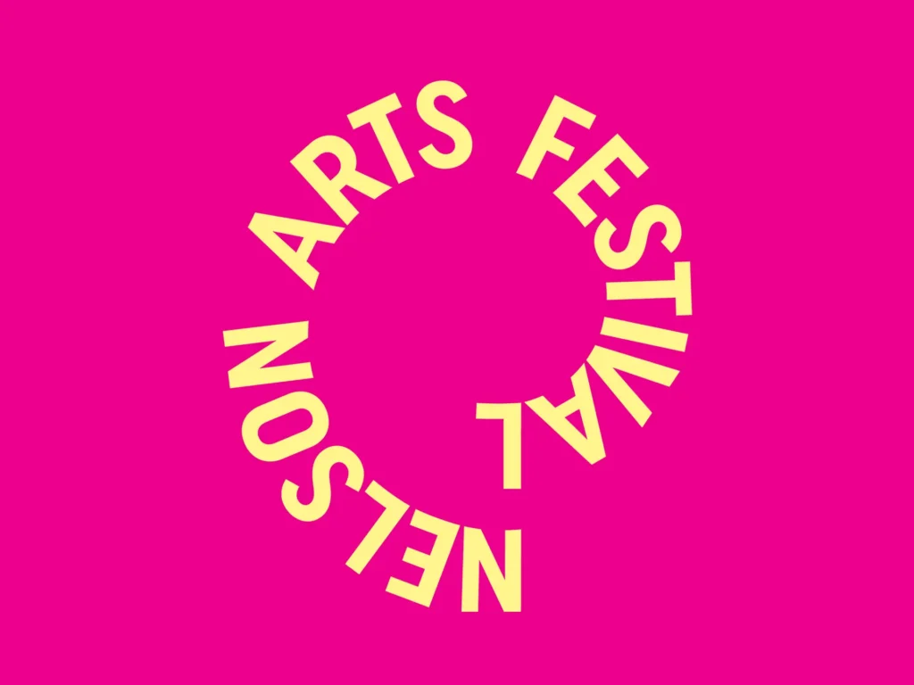
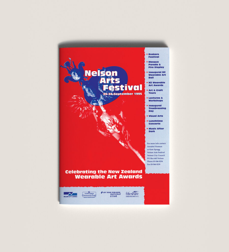
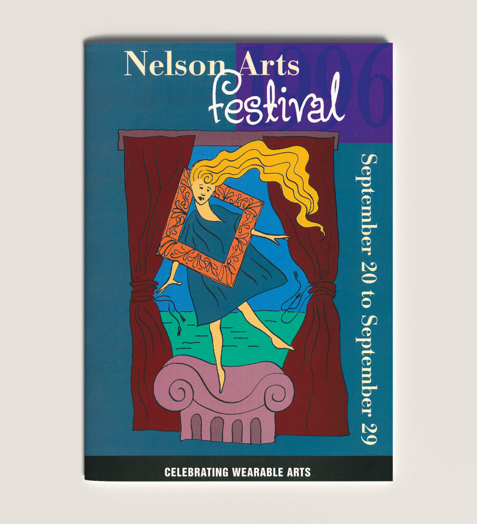
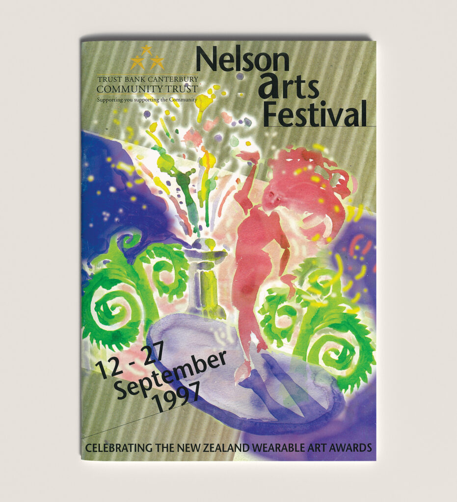
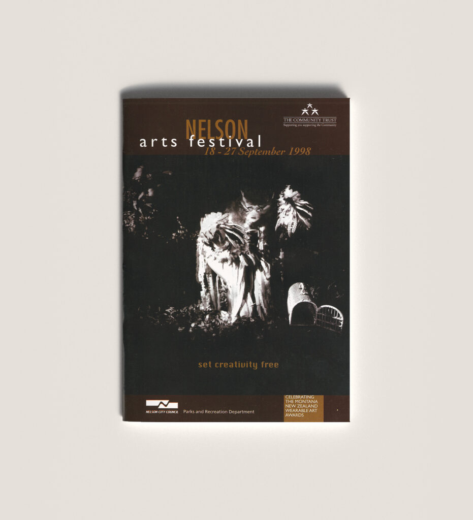
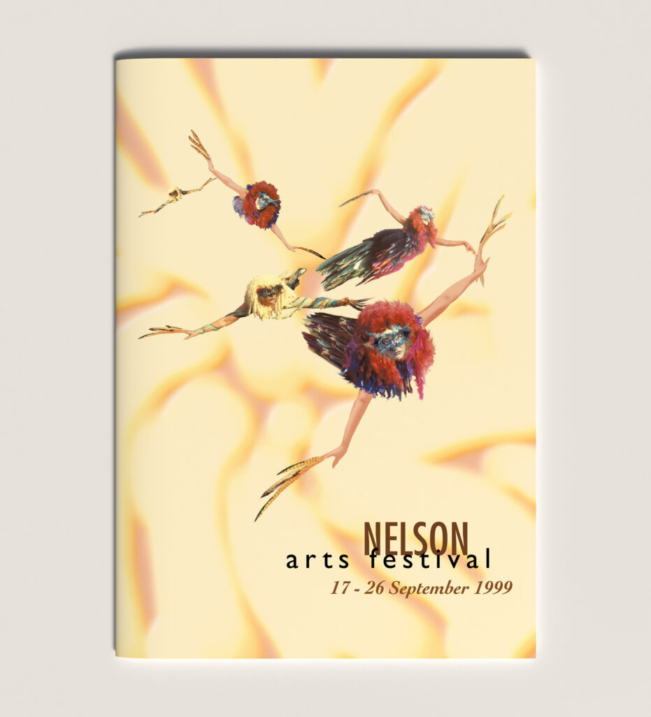
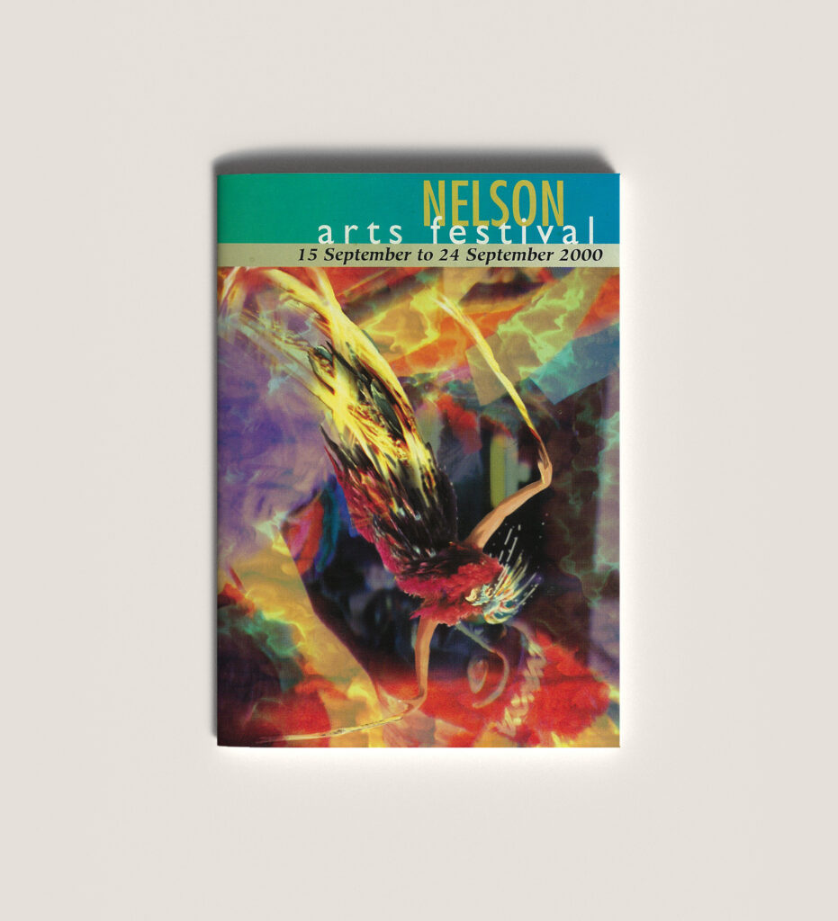
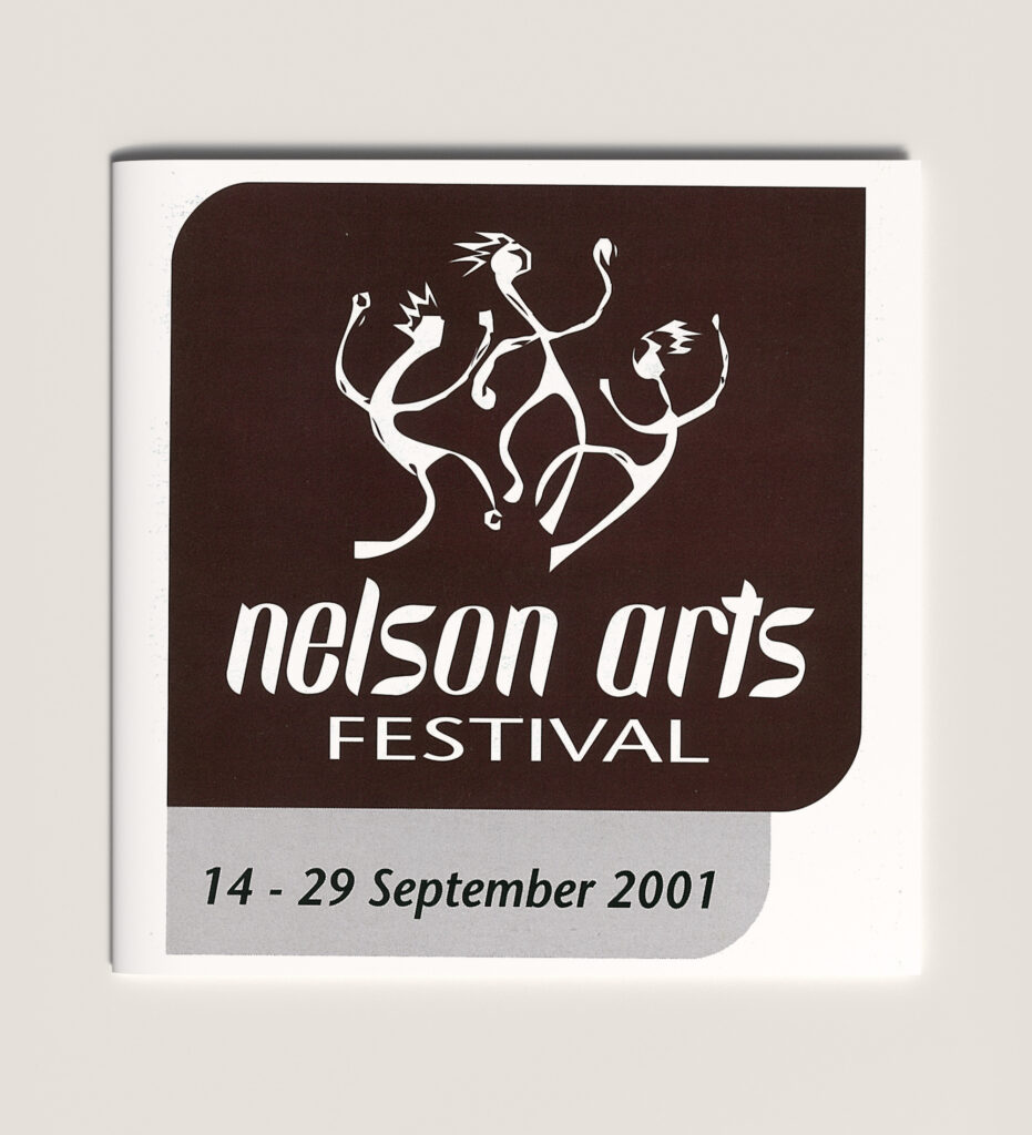
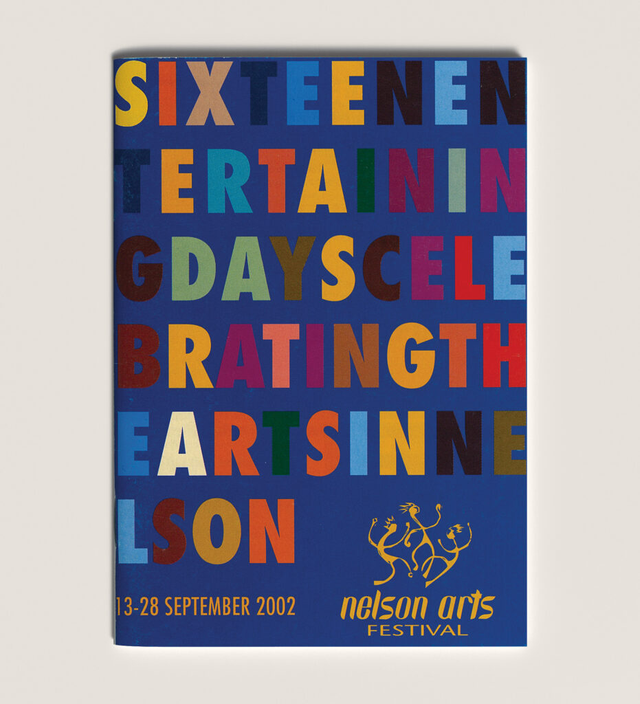
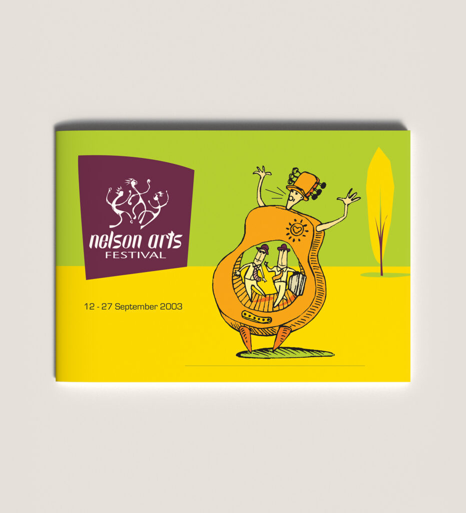
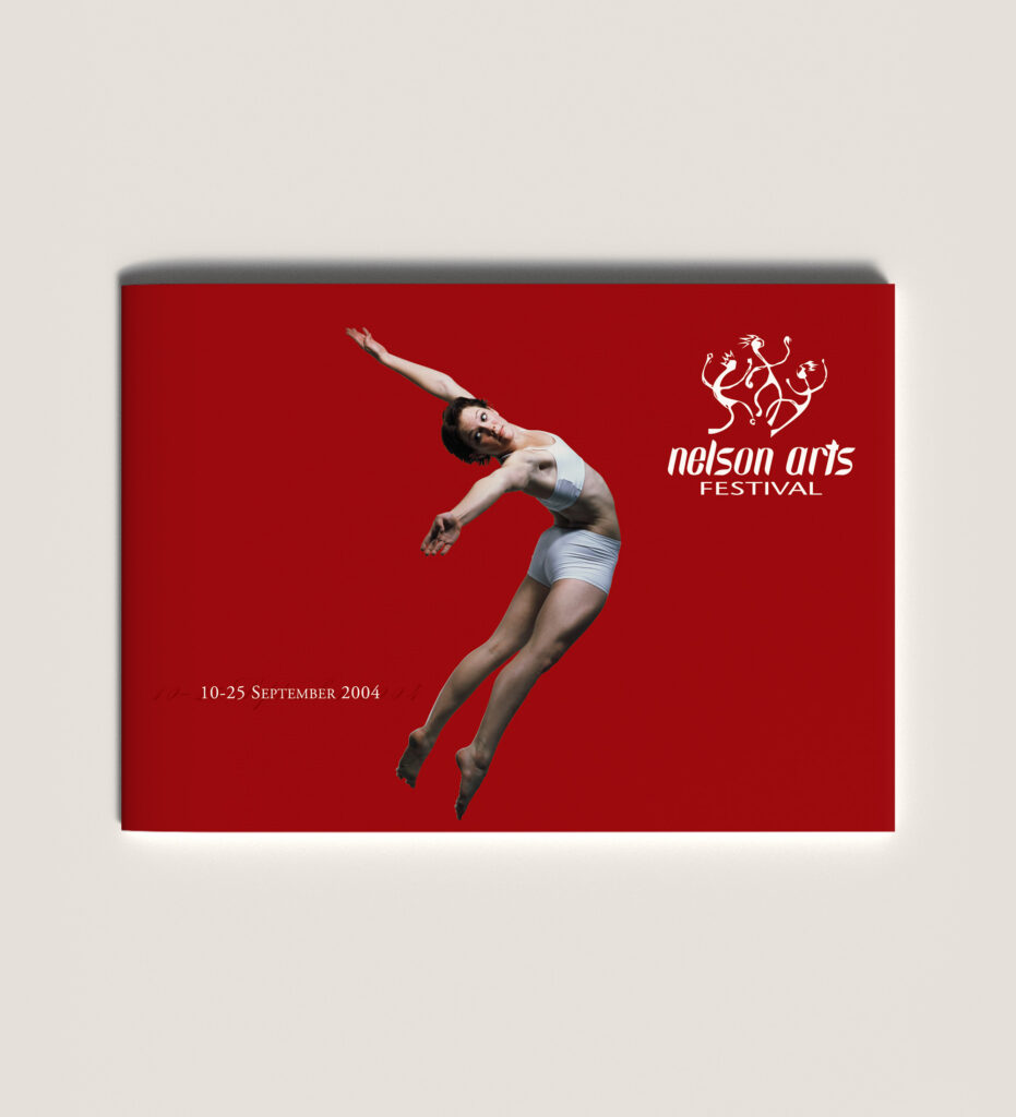
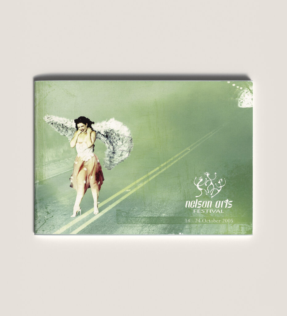
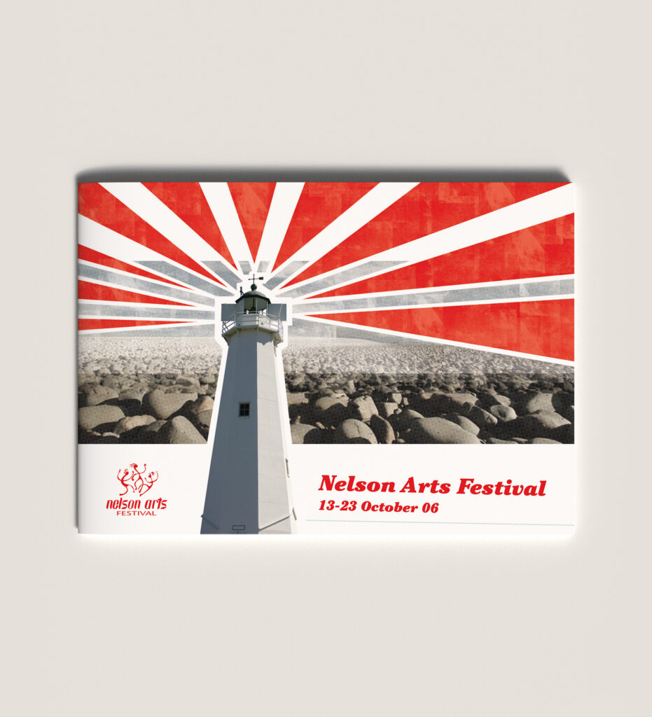
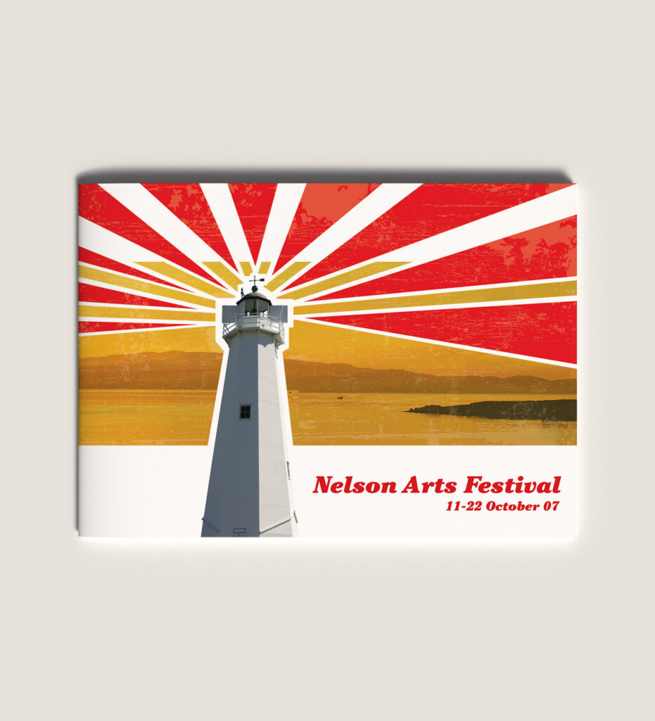
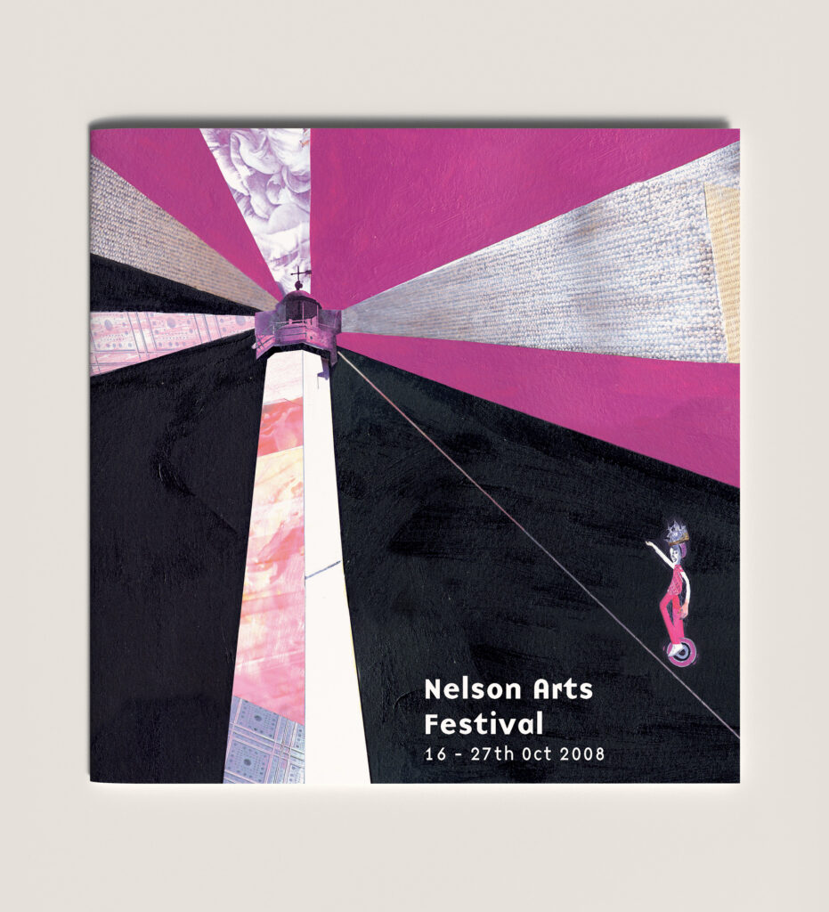
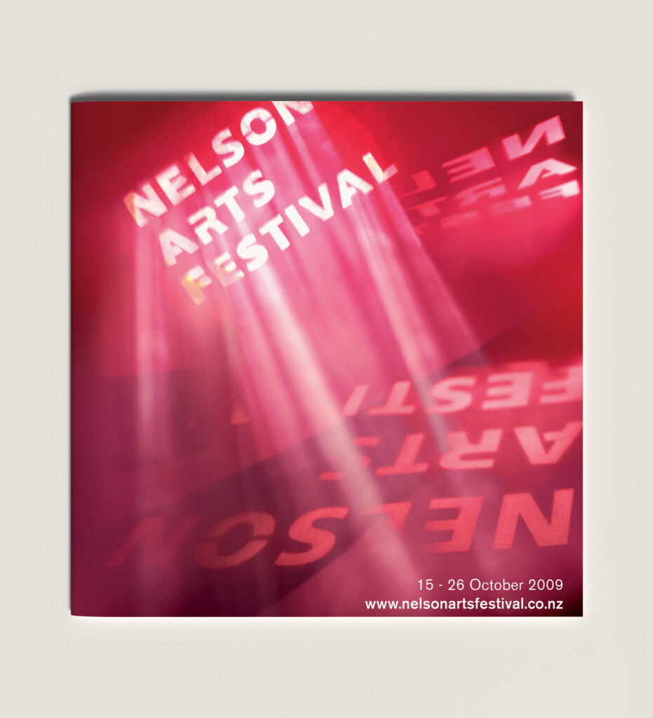
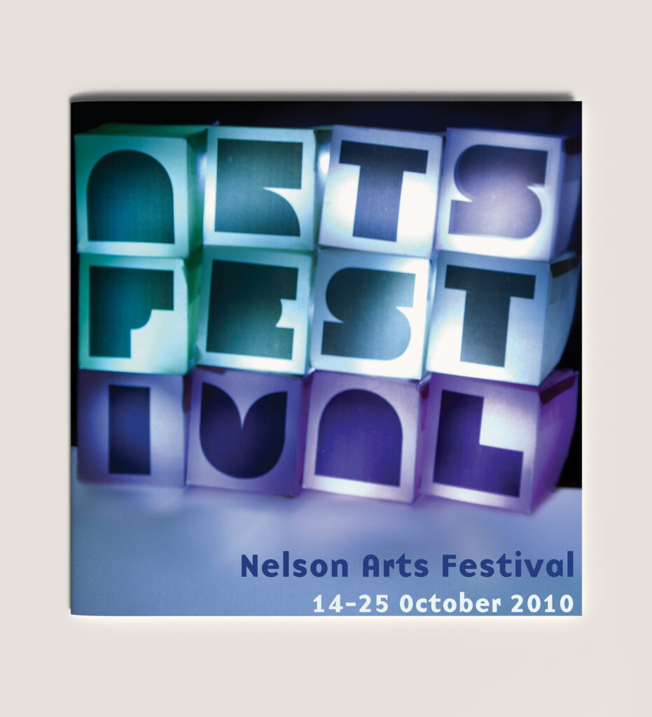
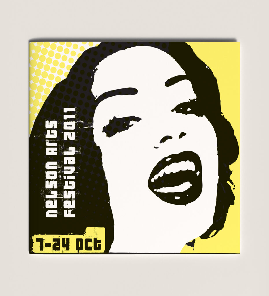
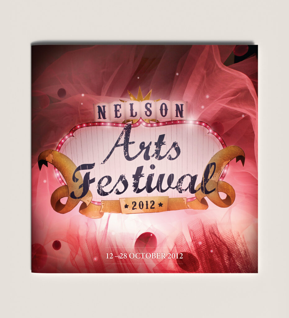
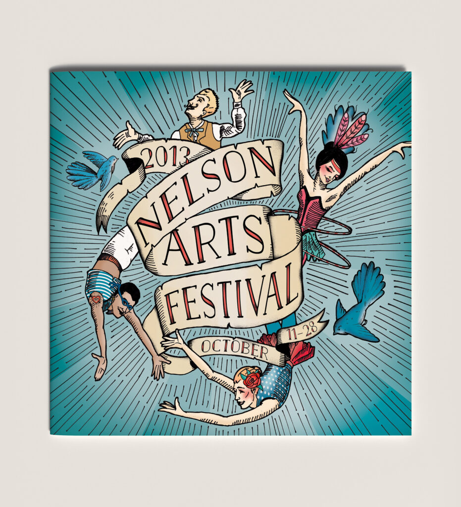
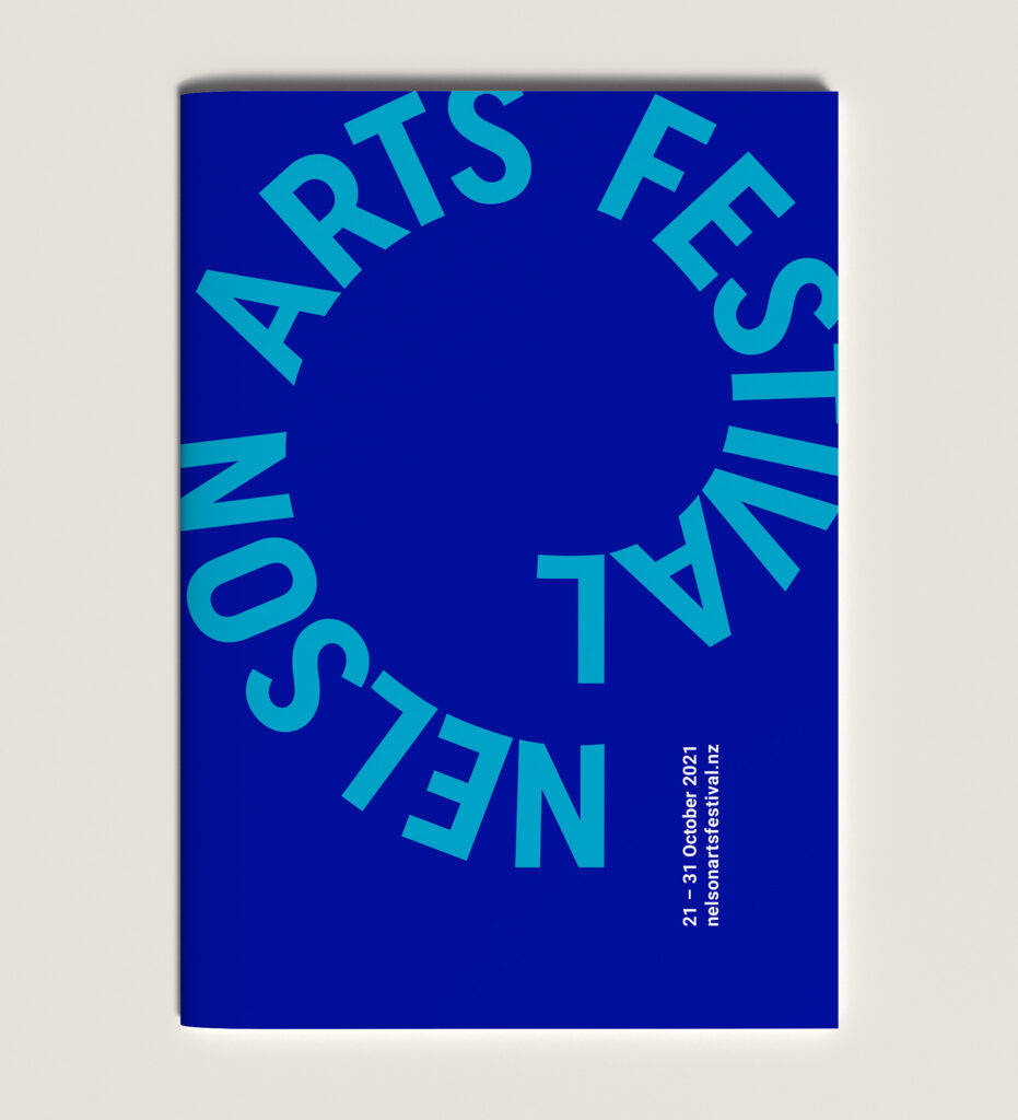
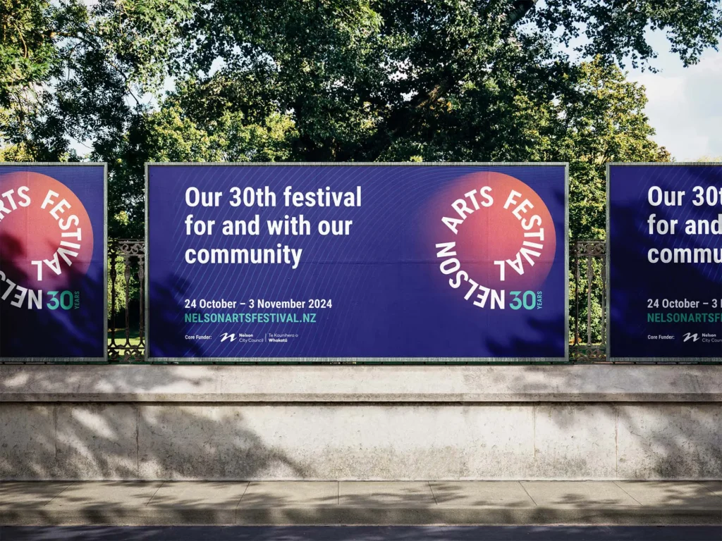
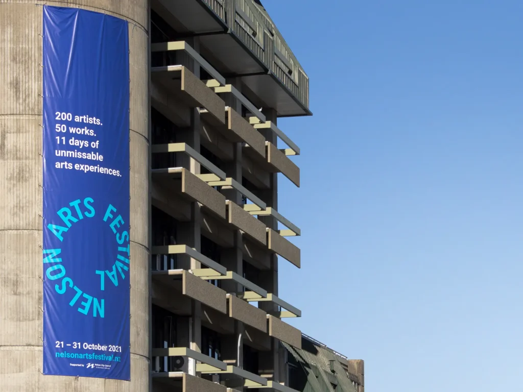
At Downing, we’ve worked alongside Nelson Arts Festival for more than 30 years, as its creative partner and as a proud sponsor. Over that time we’ve taken the festival through many brand iterations, most recently a full identity refresh in 2021, with subtle shifts year-on-year since.
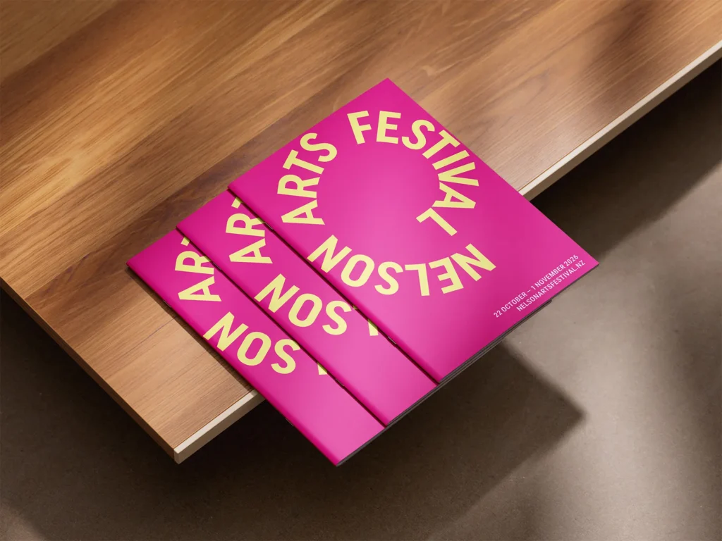
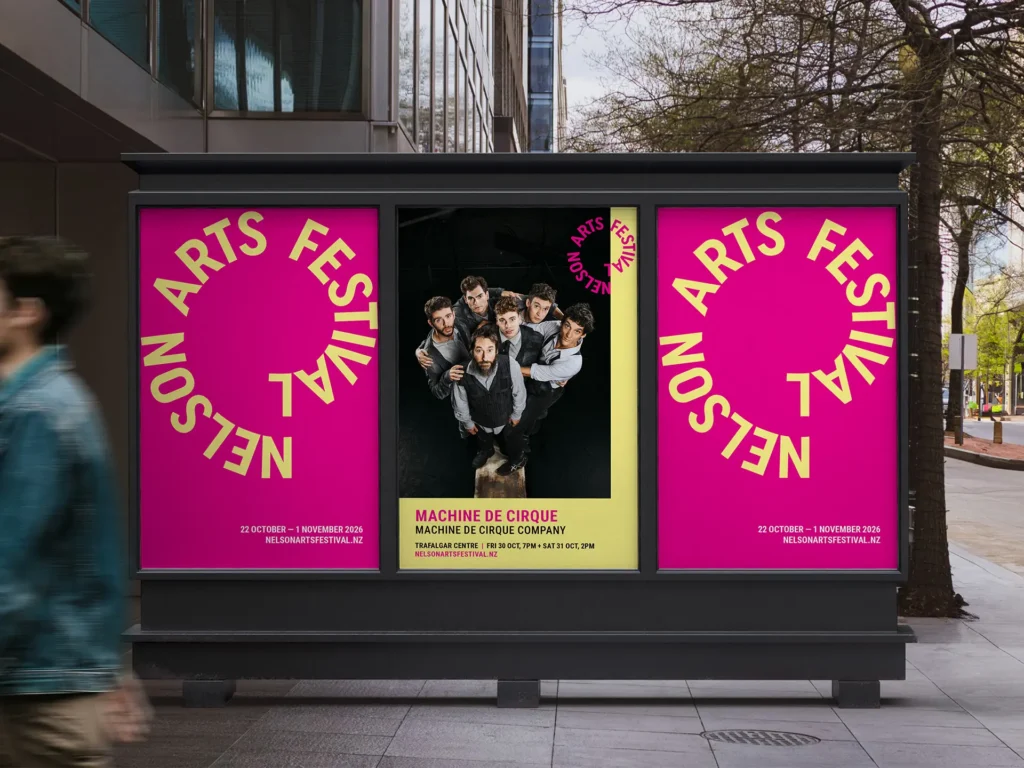
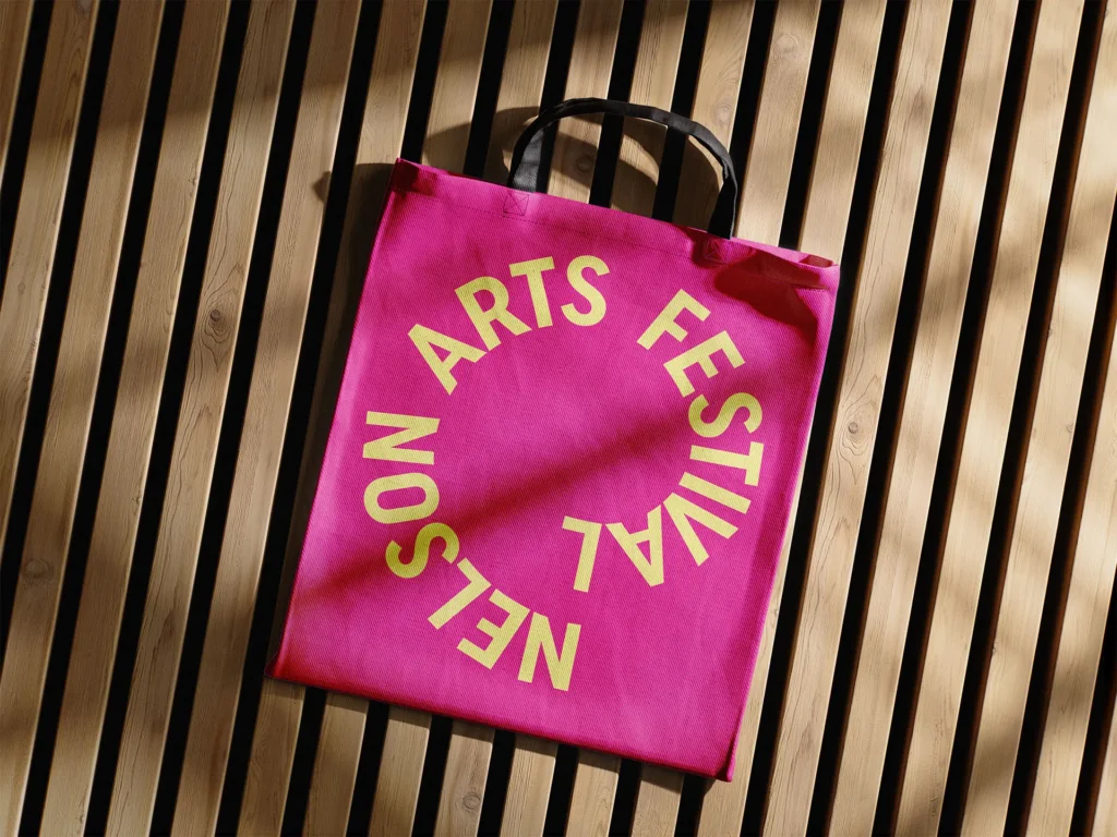
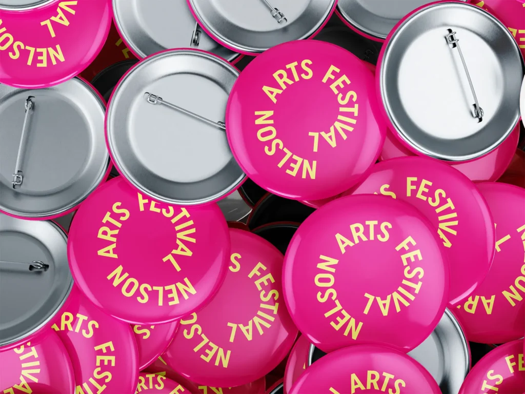
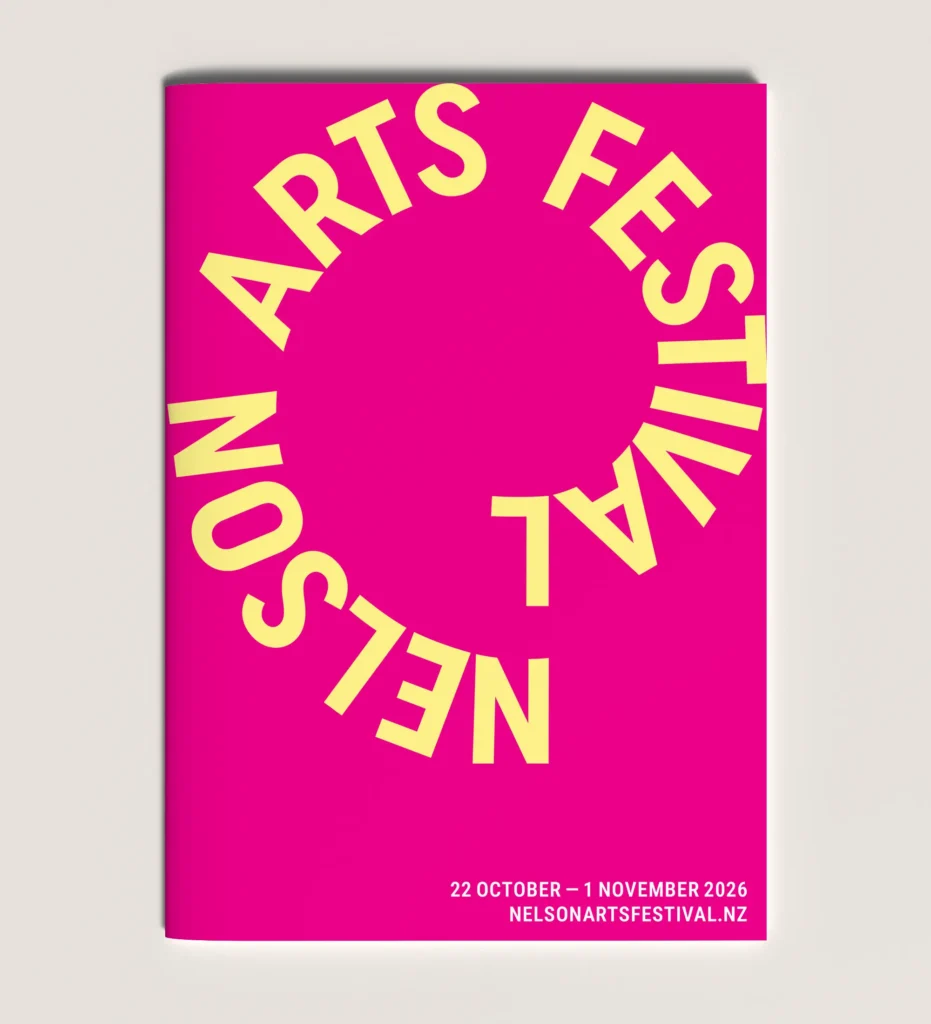
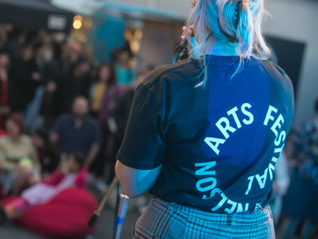
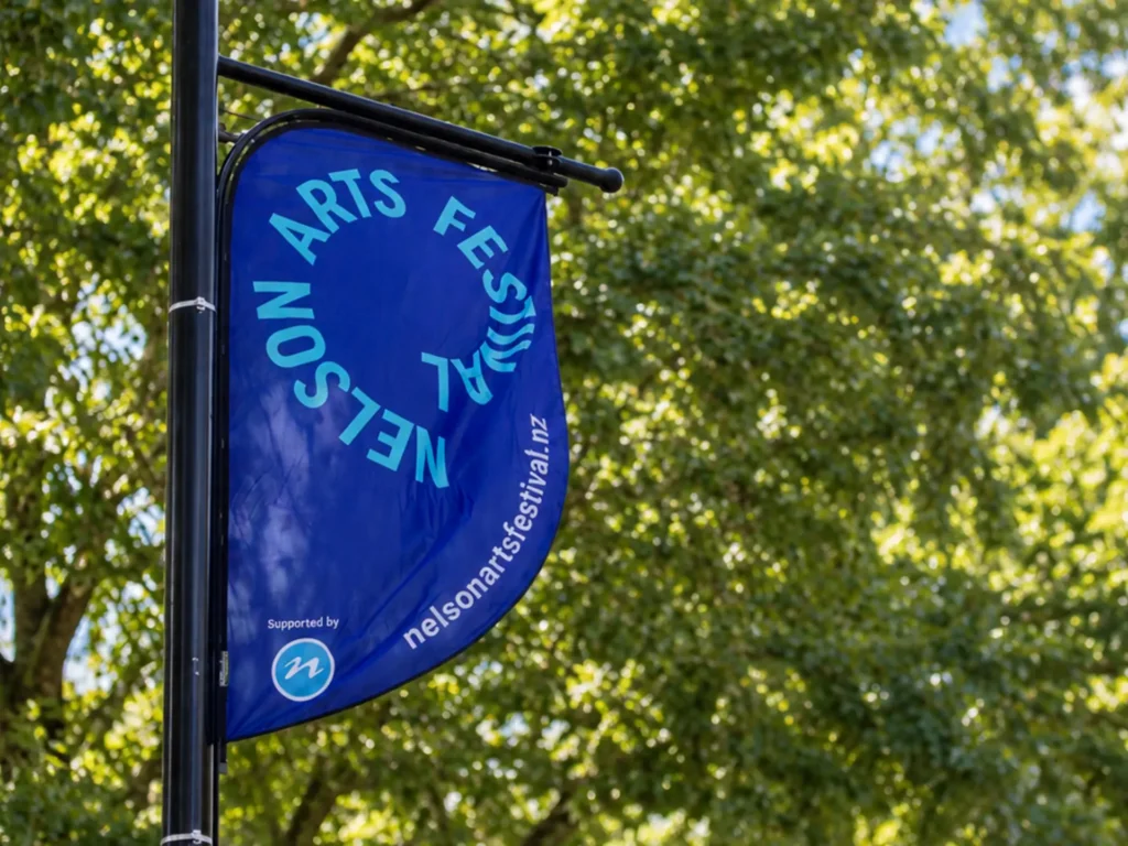
In 2026 a new festival team was at the helm and wanted to mark a fresh start. Our job was to give the brand new energy while keeping everything that makes it recognisably the festival people love. The answer was to keep the logo and refresh the colours.
The brief asked us to:
- Signal a new beginning that acknowledges the new team and its direction
- Be highly accessible, because the festival is for everyone
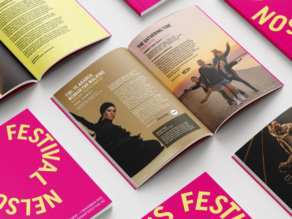
- Be simple to reproduce consistently on banners, programmes and screens
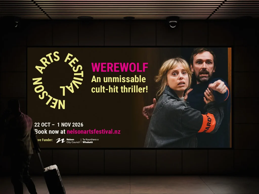
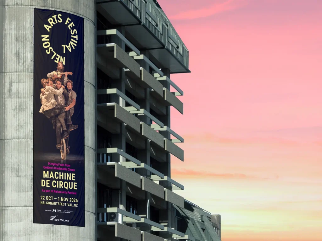
- Own the street and stop people mid-stride in festival season


The Challenge
Change everything without changing a thing
New leadership often comes with the urge to start again. But together with the Arts Fest team, we agreed that the logo we created in 2021 held real equity. People recognise it and connect it with great nights out, and that wasn’t something either of us wanted to lose. The challenge was to announce a fresh start without throwing away decades of trust with audiences, artists and funders.
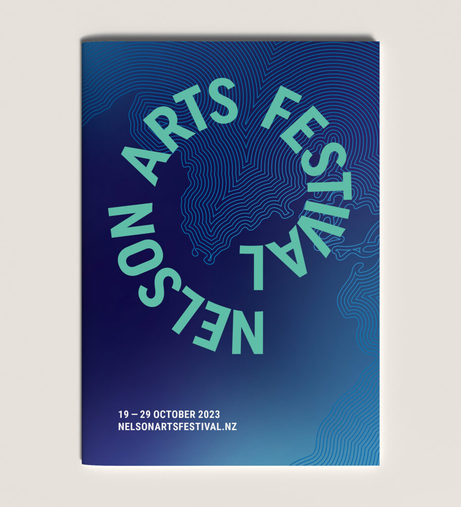
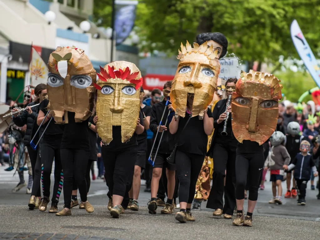
We’d also been quietly preparing the audience for this moment. Since 2021, each festival had brought a small evolution of the brand, usually visualising a core metaphor that gave each year its own story. Festival-goers had come to expect something a little different every year, so a bolder shift would feel like a natural next step rather than a shock.
We’d also been quietly preparing the audience for this moment. Since 2021, each festival had brought a small evolution of the brand, usually visualising a core metaphor that gave each year its own story. Festival-goers had come to expect something a little different every year, so a bolder shift would feel like a natural next step rather than a shock.
The Creative
A palette built for the real world
Colour was the heart of this refresh, so it had to be completely right, and that goes beyond looks. Every colour in the new palette is a single CMYK print colour, which keeps colour shift to a minimum across printers, stocks, materials and screens. A banner on Trafalgar Street, a programme in someone’s bag and a social post on a phone all show the same festival.
We tested the palette for contrast and legibility so it’s accessible to every audience. The colours are bright, saturated and made for the street, so they’re hard to miss in festival season.
We tested the palette for contrast and legibility so it’s accessible to every audience. The colours are bright, saturated and made for the street, so they’re hard to miss in festival season.
Pukapuka Talks: the same family, its own voice
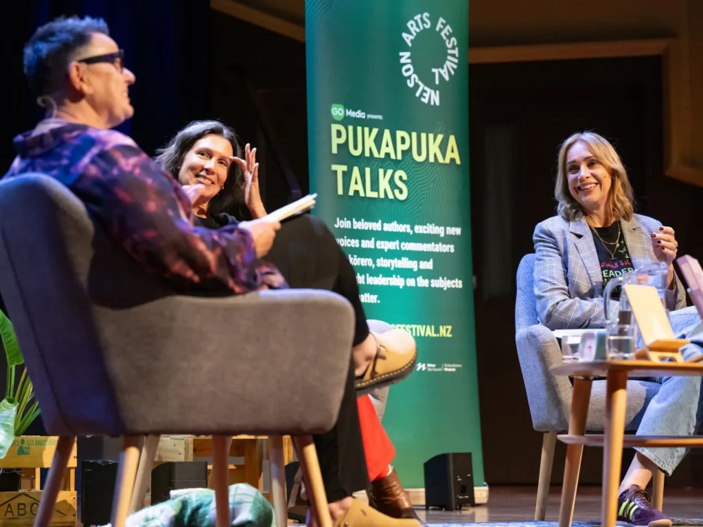
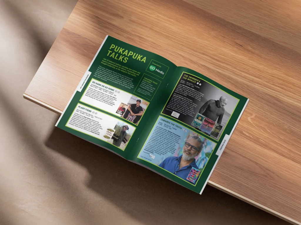
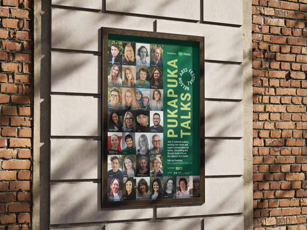
Pukapuka Talks has always had its own identity, with green at its heart. Rather than fold it into the new palette, we kept the green and brought it into line with the duotone look of the core festival brand. Pukapuka Talks now sits clearly within the festival family while keeping its own voice, and the readers and thinkers who return every year recognise it instantly.
A partnership three decades in the making
Our partnership with Nelson Arts Festival has lasted through new directors, new venues, new audiences and many brand changes. That history gives us something you can’t put in a brief: a real understanding of what the festival means to its community, and of which parts of the brand are worth protecting.
It also means we can bring real value when things change. When an organisation welcomes a new team, we’re often the ones holding the brand knowledge that might otherwise get lost in the handover.
We believe in what the festival does for our region, and that is why we sponsor it. As a Whakatū Nelson agency, we see creativity as one of our region’s greatest strengths. The festival gives local talent a stage, brings the world of arts to our doorstep and shows the rest of Aotearoa what this region can do. Supporting it means investing in the creative community we’re part of.
It also means we can bring real value when things change. When an organisation welcomes a new team, we’re often the ones holding the brand knowledge that might otherwise get lost in the handover.
We believe in what the festival does for our region, and that is why we sponsor it. As a Whakatū Nelson agency, we see creativity as one of our region’s greatest strengths. The festival gives local talent a stage, brings the world of arts to our doorstep and shows the rest of Aotearoa what this region can do. Supporting it means investing in the creative community we’re part of.
The Results
The festival has a zingy, new identity that marks a fresh start for its new guardians while still unmistakably the Nelson Arts Festival. It works on the street, stays consistent across every application and is accessible to everyone.
For us, it’s another chapter in a partnership we’re proud of, and another chance to back the creative region we call home.
For us, it’s another chapter in a partnership we’re proud of, and another chance to back the creative region we call home.
Contributors
Video: Innit Creative
Event photography supplied by Nelson Arts Festival.