Travel&Co
Travel&Co Brand Refresh: Transforming into Snow Holiday Specialists
Overview
When Travel&Co approached us, their business had evolved to specialise exclusively in snow holidays and the brand felt disconnected as a result. So Downing developed a refreshed brand identity that emotionally connects with both seasoned snow enthusiasts and first-time adventurers, positioning Travel&Co as the go-to experts for unforgettable snow holidays



The Challenge
When Travel&Co approached us, their business had evolved to specialise exclusively in snow holidays. Their existing brand identity no longer reflected this focus, creating a disconnect between who they were and the experiences they offered.
The Strategy
We began with facilitating strategic brand workshops to explore their audience, business challenges, and product offering. From this, we developed a clear set of Brand Pillars and a distilled selling proposition. This strategic foundation shaped a full brand refresh timed for launch at an international travel trade expo.
The Creative Solution
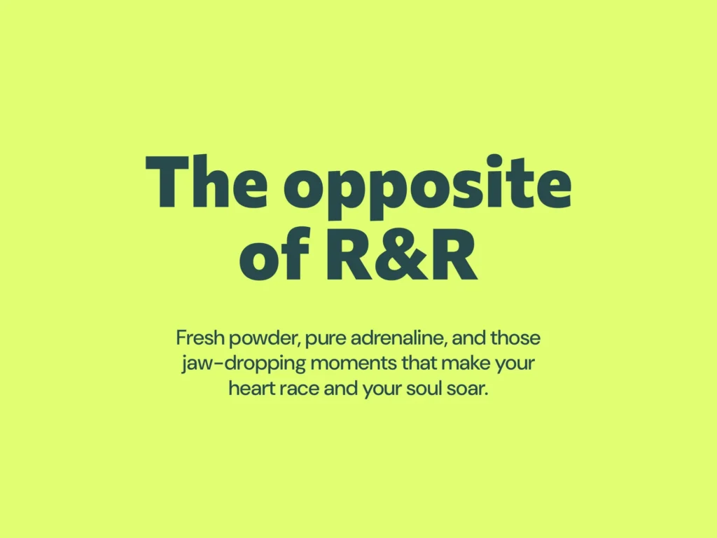
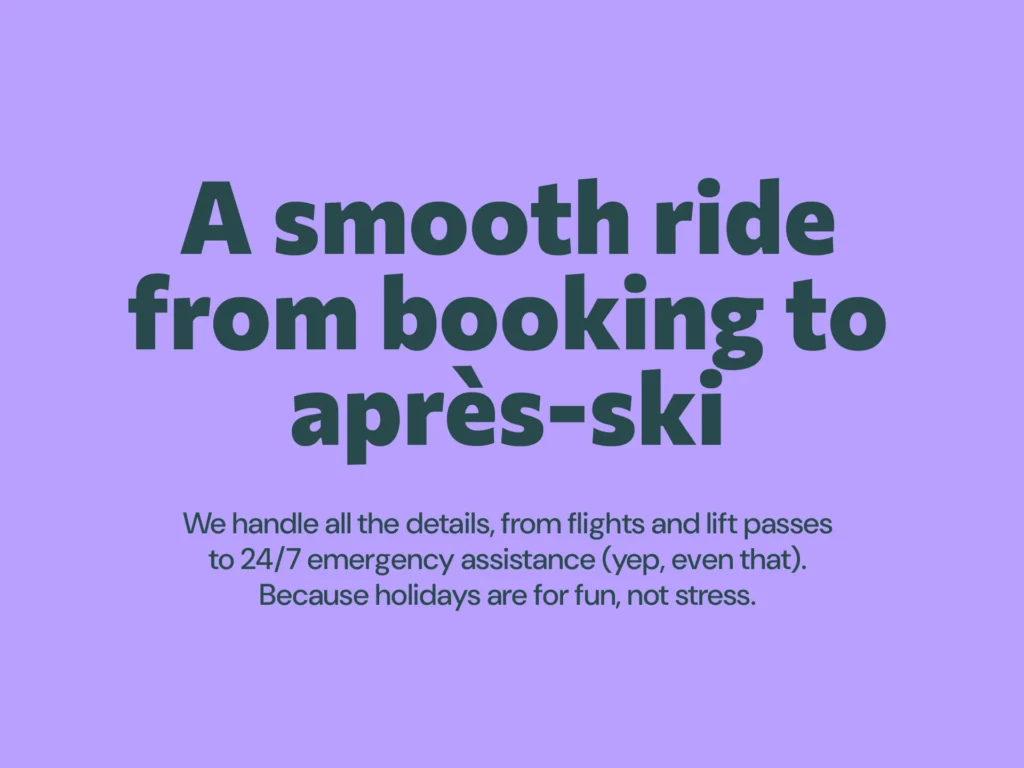
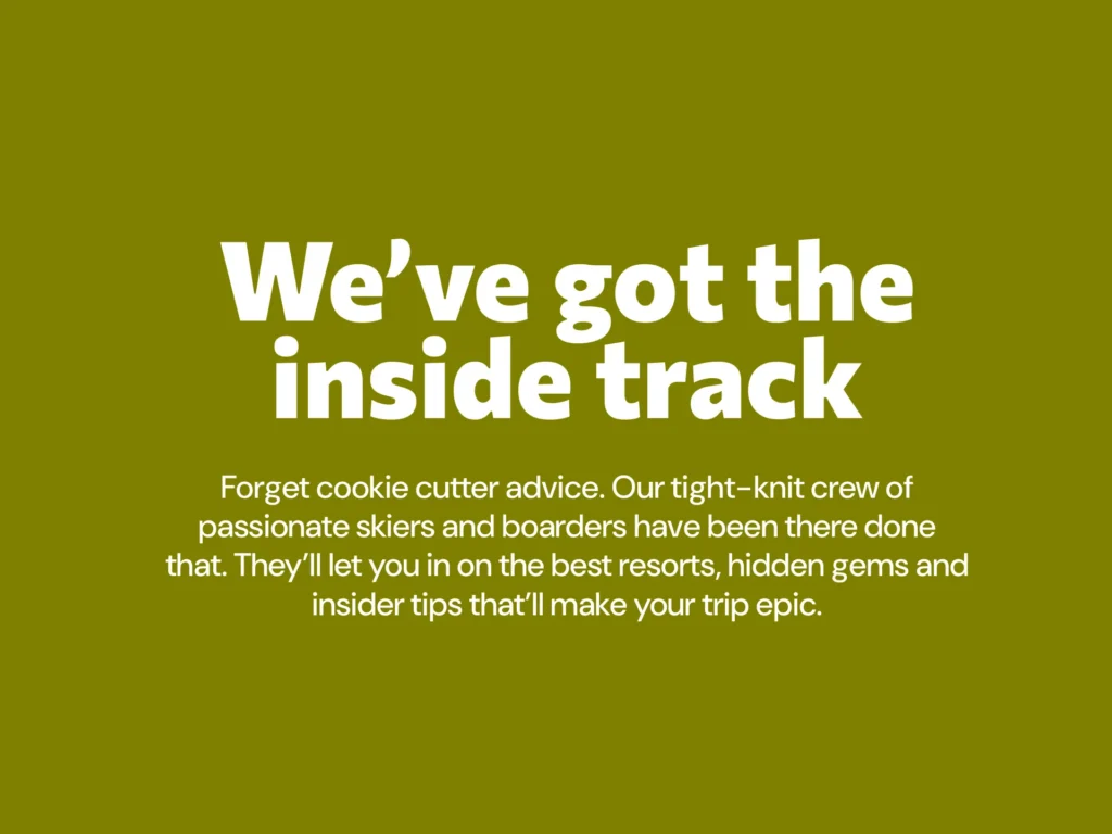
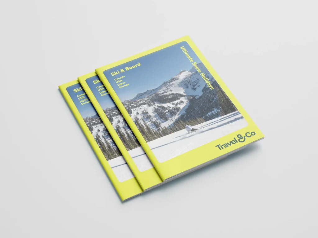
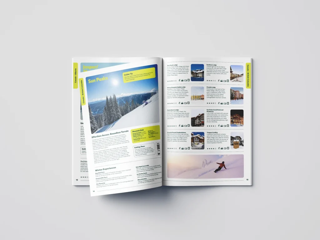
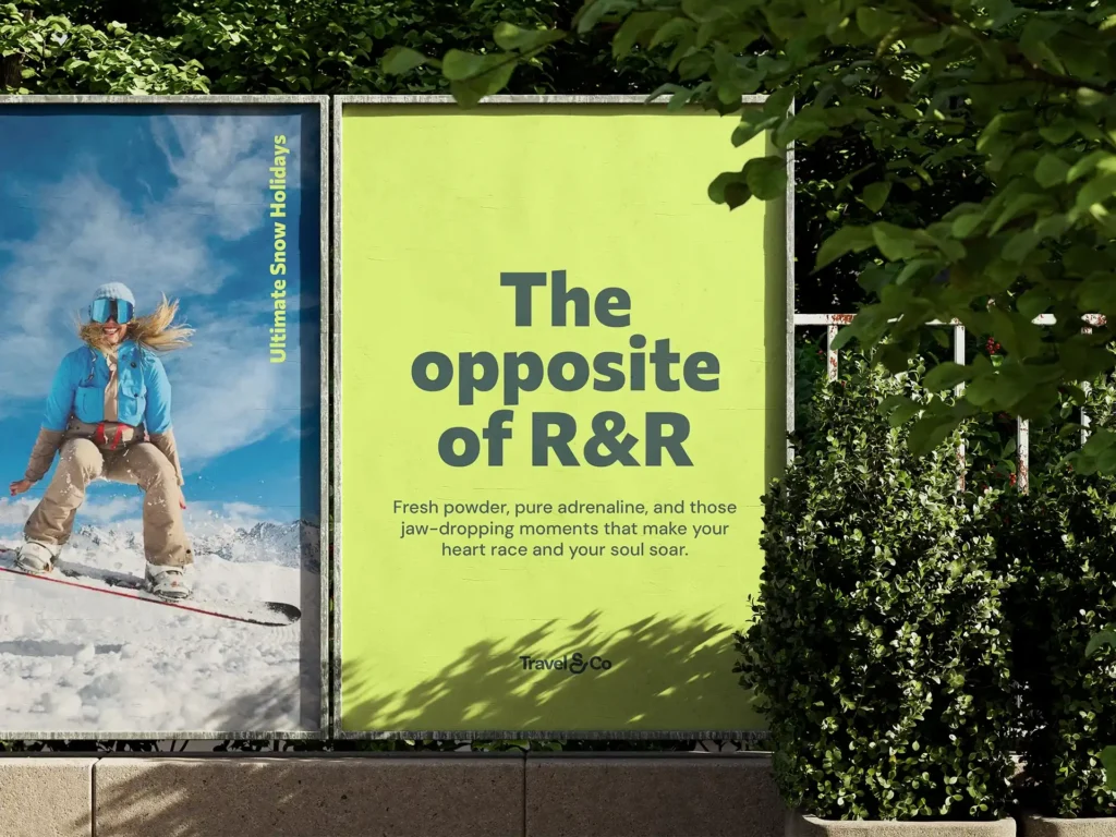
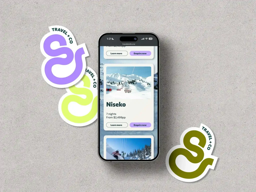
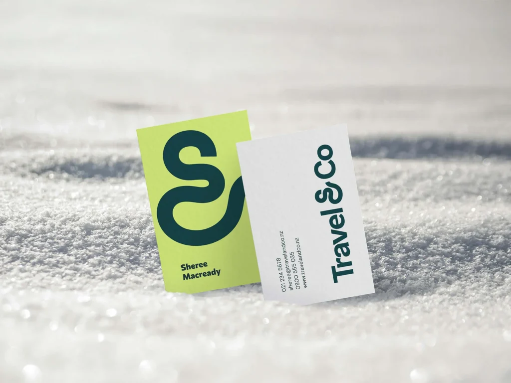
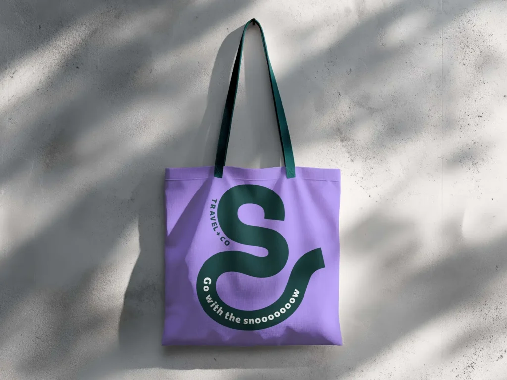
The new brand positioning confidently communicates Travel&Co’s unique value as snow holiday experts. Visually, the refreshed identity is versatile, energetic, and modern. A bold colour palette, distinctive design system, and fresh copywriting work together to capture the excitement of adrenaline-filled alpine adventures while inspiring trust from travel agents.
Our creative team delivered:
Our creative team delivered:
- A cut-through brand tagline
- Compelling brand messages and headlines
- Inspiring copywriting to connect with snow lovers and travel agents
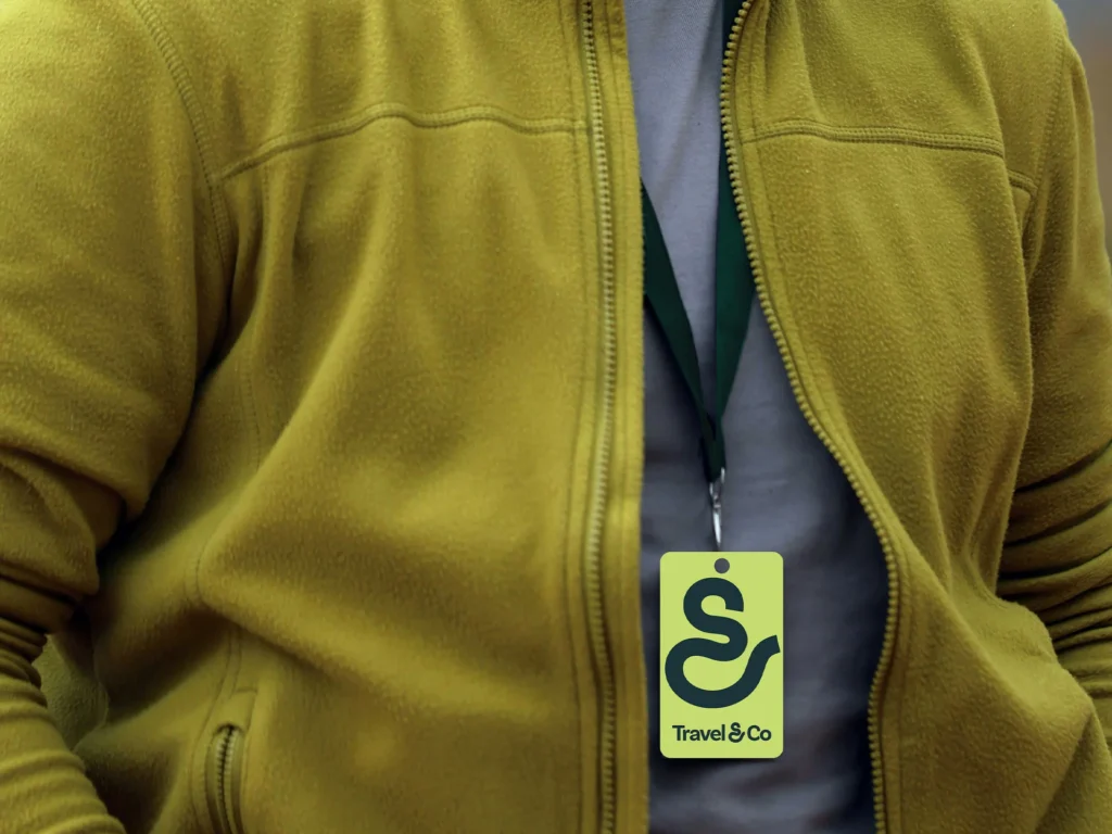
- A distinctive new logo design
- A vibrant colour palette that brings energy and recognition
- Photography art direction to capture the thrill of snow holidays
- A flexible graphic system for consistency across digital and print
The result is a brand that emotionally connects with both seasoned snow enthusiasts and first-time adventurers, positioning Travel&Co as the go-to experts for unforgettable snow holidays.

Hopefulness is the fuel that makes growth possible.
A Brand Isn’t Born in a Day: The importance of investing in your brand over time

Can AI Build a Website — And Should it?
“Shut the fluff up!”

How emotion drives long-term marketing success

How to make your business visible to AI

Branded Search: Your Shortcut Through the AI Clutter

Become more famous and get luckier

Why should I choose you?